Basic Rules For Writing Effective Business Emails
1. Crafting powerful business emails
2. Welcome emails: A warm first impression
3. Landing in the inbox: Avoid the spam folder
4. Measuring success: Metrics and optimization
5. Boosting response rates: Get more out of every email
Useful tools:
1. Newoldstamp - Email signature marketing
2. Mailchimp - Email builder and sender
3. Reply.io - Personal email outreach, calls, and tasks
4. Mailsuite - Email link opens tracking
5. Canva - Online tool for making designs
How many letters do you send every week? Dozens? Hundreds? We do. And get feedback. The core of proper business email writing is to apply some rules to your letters, to engage the reader and encourage them to perform some action - sign a contract, buy a product, start a trial, or message you back. To achieve these goals, you need to stick to specific rules. An email is an efficient tool for business communication, but you need to use it properly to get the maximum of it. Here's your guide to mastering the art of business email.
Crafting powerful business emails
Make use of a subject line
An email without a subject is just like a newspaper article without a headline. You will hardly pay attention to such an article. So, if you want to draw attention to your email, do not leave the subject line blank, as such a letter may be neglected or rejected as spam. The subject should be brief but informative enough to give the reader an idea of what might be said in the letter.
Your welcome email subject line must be compelling and enticing. Consider the number of emails you receive daily and the ones you delete without reading. Some brands prefer using "welcome" in the subject line to make the email identifiable.

However, studies show that some of the most common words in subject lines that subscribers open are new, alert, bulletin, thank you sale, weekly, and other words that indicate personalization. To prevent your email from being marked as a ''spam message'', it is advisable to avoid the use of spam words like free in your subject lines.
Start your email with a greeting
Greetings in business letters should be formal and concise. Business emails do not always require addressing a person by name. Thus, you may begin a letter with a traditional “Good afternoon” or “Greetings”. If you choose to address a person by name, you may start with “Dear Dr. X,” or “Mrs. X,” etc.
Writing emails, be short
Just imagine: you get to your office, dreaming about 1,000 tasks on your to-do list, open your mailbox, see up to 20 letters, click on one of them, and open a long novel up to 2 pages in length. Great piece of business email writing, yes?
As for me, I just skip or hold over such emails.
An average person reads a letter for 4 seconds, glancing at words and deciding whether to read more. Therefore, do not steal the reader’s time. Just be clear, up to the point, and briefly write professional emails.
Be engaging
However, what should you do if your letter contains more information than seven lines? Writing an email is engaging. What does it mean?
Famous copywriter Joe Vitale claims that the more expensive your product is, the longer a copy should be. This sounds good also for business letters. You must consider a client’s needs and write about exciting things. Determine what your addressee needs and respond by writing a business email.
Be polite
Since your recipients cannot see your face and emotions, they will judge you by your writing style. Ensure your letter is written politely, and never push on your recipients. Use a positive tone, and do not forget to write “thank you,” “please,”” thank you for understanding,” and other polite phrases.
Be proactive
Predict what a person behind a screen thinks when writing a professional email. Your letter should be built step by step, leading the reader to the desired action. Insert questions and answers, discuss some points, and agree with the reader. Never try to hide if there are problems; be sincere when writing an email.
Talk about your recipient
Many authors make the widespread mistake of being so selfish that they do not take care of their readers. People love to talk about themselves, and they love reading about themselves even more. How do you write emails that work? Just speak about your addressee and their benefits or interests, or describe and solve a problem.
Pay attention to words
Business email writing definitely requires some style and approach. But are you thinking about the words you use? Try to avoid anything that underlines your uncertainty (like probably, maybe, I guess). Do not overdo with “I” and “me.” Use positive words, and be simple, polite, and welcoming.
Proofread your letter
Before clicking the “Send” button, remember to proofread and edit the email. A letter with spelling mistakes and misprints will unlikely make a good impression on your business partners or customers. So, no matter how busy you are, double-check your letter and make sure it contains no grammar, spelling, or punctuation mistakes.
Finish with the call to action
You probably have some aim when you write an email. What is it? If you understand the goal clearly, you should finish your letter with an appeal. Writing a professional email and asking a reader to perform some action will increase the probability of getting feedback. Your call to action should be your last sentence, foolproof and without options to choose between. Just “call me,” “reply by tomorrow,” “go to a website,” whatever you need.
To maximize deliverability and ensure your emails reach the right audience, consider using the best email warm up tools before sending.
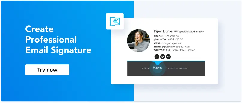
End your email with a signature block
A signature is a logical ending to any letter and is your last chance to make your email exceptional. An email signature should contain your personal and contact information. It can also include information about your business or the products you offer. By creating an email signature once, you can use it for as long as it suits your needs.
With Newoldstamp, you can create your personal email signature with a call-to-action button or banner. Our easy-to-use email signature editor allows you to generate professionally-looking signatures for personal and corporate needs.

Welcome emails: A warm first impression
The welcome email is among the most critical components of list building and email marketing. It sets the tone for the kind of relationship you wish to build with your new subscribers and helps them engage with your brand. When done right, welcome emails lure subscribers into being enticed by your brand and interested in supporting your mission.

source: Inretospect
In addition to increasing sales and awareness, a welcome email is also an avenue to reach out to your audience and build good relationships. However, seeing your lists as something other than a way of making money but as people who can improve your brand and help you grow is essential. Consequently, your emails to your customers must provide some benefits and leave a significant impression. You must see your list as money you can make and people who can help you grow and improve. It is important that the emails you send to your subscribers offer some benefit to them and leave a lasting impression, and you should do that from the first email.
Types of welcome email for new customers
- The general welcome email
Sincere and straightforward, this type of email aims to appreciate your subscribers for signing up and provide them with relevant information about the kind of emails they will receive. One of the benefits of this type of email is to establish trust with your customers and make them feel valued.

- Welcome email with a showcase
Welcome emails with showcase are a common type of welcome email in which what you offer your subscriber is showcased. This is great for engaging customers who would like to see the benefits of signing up. It is essential to make it significant, as adding irrelevant features to showcase can make the whole message useless. Because it is popular, it may not command attention like other email types. Some minimalist features can be used when your subscribers are used to large volumes of promotional messages.

- Welcome email with the offer
Although simple but effective, this type of email gives new subscribers a vital offer to buy the brand's products while they gain attention. Since most customers like getting great deals, a special discount for every product purchase can be a perfect avenue to improve the conversion and click rates from your emails. Ensure your offer is attractive, and avoid formatting it as an image. More than 60% of subscribers block emails sent as images by default; therefore, if your offer is placed at the center of your welcome email, it might get blocked, and the results may be jettisoned.

- The personal welcome email
According to Experian, the personal welcome email is 26% more likely to be opened. It is a type of welcome email with the relevant data of the subscriber, with segmented details using where and how they signed up. This type of email is tailored to reinforce your subscriber's decision. Apart from using the subscriber's name, most of the information given when they signed up, such as the business type, goals, interests, etc., can be used to personalize the message.

Landing in the inbox: Avoid the spam folder
Email spam is an irrelevant, unsolicited email sent to many people who, as a rule, did not choose to receive it. For example, Mr. X purchased a list of email addresses to spread the word about the launch of his new software. At first sight, that list of contacts may seem like it could contain some valuable prospects for Mr. X’s business, and he wants to send them an email with a relevant offer they cannot refuse. However, those people didn’t give him explicit permission to contact them. Therefore, sending a newsletter or any other content to that list would be considered spam.
Key anti-spam laws
Many countries have enacted anti-spam legislation to combat spam emails. If your audience is located in the United States, you must follow the CAN-SPAM Act.
If you email someone from Canada, you must comply with the CASL (Canada's Anti-Spam Legislation). Those are intended for people who will send commercial advertisements or promotional emails. While the regulations vary from country to country, the most essential elements are pretty similar:
- You shouldn’t use false or misleading header information (names, reply-to addresses, subject lines);
- It is obligatory to provide an unsubscribe link that must work for at least thirty days after sending;
- It would help if you told recipients where you are physically located;
- Subscribers must have actively opted into your list;
- If someone else (for instance, a marketing agency) is sending emails for you, you need to monitor their actions and ensure they don't violate the CAN-SPAM guidelines' requirements.
Otherwise, you may be subject to heavy penalties.
Most popular spam email lists

image courtesy of senderscore
Getting blacklisted happens to many email senders, mainly if they deal with email marketing, and it is brutal because it has a direct impact on email deliverability. If you got blocked, it has been more likely caused by poor mailing list quality and a fair number of end-user complaints. To avoid email blacklists and spam folders, be sure to check if your IP address and domain aren't on any of these popular lists:
- Composite Blocking List (CBL)
- Return Path Reputation Network Blacklist (RNBL)
- Spamhaus Block List (SBL)
- SpamCop Blocking List (SCBL)
- XBL Exploits Block List
- Passive Spam Block List (PSBL)
- Invaluement
- Barracuda Reputation Block List
- Lashback (UBL)
If you don't want to go through the hassle of manual checking, you can simply use an email blacklist checker, which automatically queries these popular lists quickly.
What do spam filters look for?

image courtesy of junkemailfilter
Basically, most spam filters check your emails for specific "spammy criteria" like:
- A subject is all capitals or a grammatically incorrect subject line
- Spammy topics (for example, viagra, body enhancement, $1, 000 000 jackpot, etc.)
- Links to untrustworthy resources
- Too many images and not enough readable text
- The bad reputation of the sender
- Low subscriber engagement
- And more.
How to prevent email newsletters from going to spam
If you want to prevent emails from going to spam, follow these tips:
Tip #1: Don't purchase or scrape your email list
Stop buying email lists. Otherwise, you’ll end up in a spam folder. Also, you risk violating anti-spam regulations mentioned earlier in the text and may be fined.
Tip #2: Send email only to subscribed users
Your content is only helpful if you send it to the right audience.
Tip #3: Use double opt-in for newsletter subscribers
The double opt-in confirms that the user who entered their email address does want to hear from you. If there is no extra confirmation (single opt-in), any user could enter somebody else's email address to sign up. From the perspective of email list owners, the double opt-in is crucial because only people who genuinely want to be on their list are signed up.
Tip #4: Validate your email with SPF, DKIM, and DMARC

image courtesy of uptakedigital
To ensure that your message is getting into the inbox of your customers, not into the spam folder, you will need to authenticate it with SPF records (Sender Policy Framework), DKIM (Domain Keys Identified Mail), and DMARC (Domain-Based Message Authentication Reporting and Conformance).Those are email security standards for spam prevention. Nowadays, various tools can tell you if your mail campaigns are failing SPF, DKIM, and DMARC configurations, and reliable DMARC monitoring tools make it even easier by giving you real-time insights into authentication issues before they affect deliverability. They are GlockApps, Mailtester, and others. Another important step is to use a trusted email validation tool to clean your mailing list by removing invalid addresses, this helps reduce bounce rates and improves email deliverability.
Tip #5: Avoid spam words

Believe it or not, some words can trigger your email message as spam. Here are some straightforward rules that can help you avoid spam filters and get emails delivered safely.
- Nothing should be for “free”
Most marketing emails we receive are aimed at forcing us to buy something. That’s why they are competing to show us an offer so attractive that we cannot refuse and not click. The magic trigger is considerable value without payment.
Therefore, many of us have been attacked by a group of “free” offers, now a feature of spammy letters. Here are a few examples: free consultation, free leads, free DVD, free offer, free money, free quote, free sample, free trial, no cost.
Instead of saying you offer something for free, make a unique offer—for instance, a product only available in your store or a trial of a premium feature.
- Income-related spam words group
The second spam word, batch, is related to money. It’s pretty popular to hack the accounts of famous people or your friends and send you disgusting letters about investments or making millions from one dollar.

Let’s remember to avoid these spam words: additional income, avoid bankruptcy, be your own boss, big bucks, billion dollars, cents on the dollar, no fees, financial freedom, your income offer of partnership, and so on.
It shouldn’t be that hard not to use these words, however. They subconsciously sound unrealistic and fraud-like.
- “Dear” also belongs to spam words
We should regret all royal English lovers: traditional polite greetings are also on the list. Although many spammers start their messages this way, Google and other mail clients see it as an additional signal. Indeed, you will not fall out of the inbox just because of “dear” initially, but if you have a poor online reputation, it will contribute to it.

You can always use the recipient’s name instead of “dear.” It is much more personalized (obviously) and indicates that you know the person. So, any email client will assume you’ve got their email “legally.”
- Forcing a person to perform an action
All marketers know that if you want a person to buy, you should give a tempting offer and limit its duration. Thus, if the product or service impresses the reader, they are not thinking about its necessity or relevance, being driven by emotion. This is a moment of glory for a seller. The more time passes, the fewer chances to sell.
Therefore, spammers keep a person in a hurry and use such spam words as act now, urgent, do it today, don’t hesitate, not to sell anything and the lowest price.
Use smart calls to action instead. A button or link that reads “Try new product’s features” is much more appealing than “go buy now.”
- Asking to perform an action
Very close to the previous group, many email clients might treat phrases that force them to act as spam. It’s OK to use them but with caution only.
The words we’re talking about are click now, order now, buy direct, call now, and so on.
Try to support these bland CTAs with actual value. For instance, say, “Call now to learn about our demo mode.”
- Claiming they sell nothing
If you will tell your reader that you do not sell something, stop now. Many actual sellers follow this technique. However, email providers are clever enough to check it as spam words.
Therefore, never write any selling. Never offer to cancel at any time. These words are your ticket to a spam filter.
Think of a more clever way to drive customers’ attention. After all, if your product is so fantastic, why would they think of canceling anytime?
- Never try to surprise or amaze
Try to do this with quality products and services. But just listing your fantastic offer will not add value to inspiring people to buy. It will only trigger a filter to become more attentive to your content.

A list of spam words includes unique, be amazed, and easy terms; it’s effective.
Don’t say it will be effective; say why. Instead of using sophisticated adjectives, provide some case studies.
- Applying to the basic needs
Offering to solve people’s fundamental problems is the worst way of advertising. Things like “we will help you pay your debts” are almost always caught by spam filters. So, avoid such words in your emails.
- Internet marketing offers
Many people who offer marketing services do not know marketing well (or are just cheaters).
If you get or promise more internet traffic, multi-level marketing, direct marketing, direct email, increased sales, or increased traffic, be sure these are spam words.
Don’t try to deceive anyone. It’s always easy to tell if someone has little or no field expertise.
- Old-fashioned congratulations on a big success
I remember some years ago when almost every month or even week, I won something. It was a big lottery, a million dollars, a luxury car, and my old granny in London, who left me a legacy. Actually, having all those benefits, I should live at luxury resorts until the end of my life.
It’s actually kind of a meme nowadays, all these million-dollar emails. Don’t be a subject for memes, at least not in this way.
Tip #6: Link to trusted websites in your newsletter body
Did you know that spam filters check the URLs to which you link? If you choose to link to a domain with a poor reputation, the chances of email spam filters blocking your message are high.
Tip #7: Consider your image-to-text ratio
Including images in your email marketing campaigns is OK, but only sending them with text. Write at least two lines of text for every picture you send.
Tip #8: Use only reliable image hosting services
Another reason your emails are not delivered to the recipient's inbox because you host images on an untrusted domain. Find a reputable commercial host for any pictures you include. Some examples are your server, Google Photos, or Amazon S3.
Tip #9: Limit your newsletter email size
Did you know that email size belongs to one of the spam filter criteria? Multiple studies conducted by email marketers show that the perfect email size doesn’t exceed 100 KB. But how do you make your newsletter lighter?
- Use .png format instead of .jpg;
- don't insert images in your message without any text;
- try to avoid using attachments.
Tip #10: Use only ESPs with a good reputation
If your ESP (email service provider) has a poor reputation, some of your emails will not reach your recipients' inboxes. To check your ESP's reputation, use Mxtoolbox or a similar website.
Tip #11: Receive certification
Email certification is a service provided by independent organizations with unique relations with numerous ISPs (Internet service providers) like AOL, Comcast, etc., and various spam filtering companies. So, if you send emails in large quantities all at once, it is highly recommended that you get certified to bypass some of the spam filters that every email message goes through.
Tip #12: Use a proper email address
Many spam filters are set up to look for numbers, superlative adjectives, and underscores in the sender's email address. To avoid ending up in the junk mail bin, use only straightforward and trustworthy field names, such as: “info@abccompany,” “artphoto@gmail.com,” etc.
Tip #13: Whitelist your email domain
As we mentioned above, it is crucial to use only reputable email marketing services. These services ask mailbox providers, such as Gmail or Yahoo Mail, to whitelist your domain and IP address. To be whitelisted with your recipients, you need to ask them to add your "from" address to their contacts. This will considerably reduce spam filters' attention to your emails.
Tip #14: Check your email metrics
Knowing if your email campaigns are performing well or require some changes is good. Therefore, you need to track:
- Open rates
If you noticed that your open rate is low, you could assume that the content you are sending is "unwanted" or that you haven’t cleaned your list of subscribers recently. Both can cause your campaigns to get caught in the spam folder.
- Click through rates
The click-through rate helps you understand how many users are opening your messages, engaging with your content, and taking the desired action.
- Bounces
The bounce rate is a good indicator of the quality of your list of subscribers. If your list regularly generates bounce rates higher than 2-3%, it's a sign that you need to work on your email database more carefully.
Tip #15: Regularly clean up your email list
Let's be honest: unengaged subscribers on your list could be more helpful. Try to keep only the recipients who regularly open, read, and actively interact with your content. The better the deliverability, open rates, and click rates are, the more successful your future email campaigns will be.
- Use email validators
- Deactivate your inactive subscribers
- Deactivate your bounces
Tip #16: Include your physical address

image courtesy of reallygoodemails
To comply with anti-spam laws, you must include your physical address in the footer of your emails. If you don't have an office or are working from home, use any address where you can receive physical mail from clients.
Tip #17: Add an unsubscribe link to each newsletter email

image courtesy of reallygoodemails
Subscribers will come and go, but it is not always because of you. So do not try to make the unsubscribe process as difficult as possible to keep them subscribed. Let them unsubscribe from your mailings easily. If you don’t provide them with this option, they may find it easier to click the "This is spam" button, and this is no good for you because spam complaints hurt your deliverability, while unsubscribes don't.
Tip #18: Check your newsletter sending frequency
Sending too many emails can cause your recipients to stop opening them. Conversely, sending too few messages can cause people to forget you. To find the right balance, try creating different test groups and sending your newsletters at different frequencies. Then, analyze which frequency generates the best opening and click-through rates and stick to this frequency.
Measuring success: Metrics and optimization
Understanding critical metrics like open and bounce rates is essential for optimizing email marketing efforts.
What is an email open rate?
Your open rate tells you how many people opened your email. If, for instance, you send out 110 emails, of which ten bounce (are not delivered), and 25 recipients open the email, your email open rate is 25%.

You can track the opens by adding a pixel to your email. There are several extensions (Hubspot) that you can install to do this for you for personal use. The receiver needs to be able to display HTML emails with images. Since some people might not have this, there will be a slight inaccuracy depending on the number of emails sent out. If you're a marketing professional and send out newsletters or run campaigns, your company is probably already using an email automation tool that shows you the open rate.
What is email bounce?
Distressingly often, emails that were supposed to go out to contacts are returned before they get there. The bounce rate is the percentage of your emails that come back to you.

In other words, take the number of bounced emails, divide it by your total outgoing emails, and multiply by 100. Simple, but incredibly annoying. It reduces the efficacy of any campaign by reducing the number of pairs of eyes that get to read your email.
Moreover, you will want to preserve your reputation by keeping your bounce rate to what is widely regarded as acceptable. You’ll never achieve 0%: this is impossible for various reasons. But a 2% rate is perfectly respectable. A higher rate will prompt people to take you less seriously as the professional marketing outfit you want to appear to be. And no doubt are.
Why does email bounce happen?
There are two sorts of email bounces, each with its own reason for occurring. Both will hurt your business and your attempts to escort clients down that good old relationship funnel.
- Soft bounce
This is where the receiving email server accepts the email but sends it back to the sender undelivered. Reasons for this include a full mailbox, a receiving server that is down or offline, or you simply went on for too long in your email: brevity is an under-appreciated virtue at times, and an email that is too large can often be returned to the sender by an inbox straining to fit everything in.
Soft bouncing is usually a temporary issue that is quickly resolved by you (trim that email!) or the recipient’s service.
- Hard bounce
This is where the receiving email server sends the email straight back to the sender. Reasons for this include the email address not existing, the domain not existing, or the recipient blocking delivery.
Hard bouncing is a more severe proposition in that a non-existent email address or domain will probably not spontaneously come into existence. And active blocking needs addressing.
How to increase email open rate in email marketing and beat the bounce
Here are some tips on how to get a reasonable open rate for emails and reduce the bounce rate.
- Clean up your lists
A lot of lists get a little unkempt, particularly bought lists. They can be replete with dodgy addresses and even spam traps (i.e., email addresses that have never been attached to an individual but are simply there to detect spam). Thankfully, there are list clean-up services that you can employ to get your list impeccably buffed up.
_(1).png?1715599663)
source: Gmass
Lists need updating, too, as people change addresses and jobs. If you notice that you’ve been getting bounced from an individual for months, you should probably remove them from your list. There’s no point having a list full of infertile contacts, whether they are blocking you or have moved on.
Seek permission where you can. It’s an effective means of securing engagement and is a legal requirement in many territories. You can do this via automation: when somebody comes on board, an email is triggered that seeks their opt-in for various kinds of email and other communication.
Some clients will be especially valued, and their non-responsivity will be particularly felt. Try reaching out to them through other means. For instance, you can try a free video call to re-establish contact with your client.
- Keep the subject line short
Your subject line should always clearly explain what your letter is about. When looking at a subject, a person on the other end should be able to prioritize the email's importance even before reading the content.
The subject line can be at most 50 symbols. The fewer, the better.
It's not just that our attention spans are getting shorter, but also the very simple fact that email clients will cut off whatever exceeds this limit. And let's not forget that the majority of recipients (as many as 66%) open emails on their phones or tablets, and these usually display the first 4-7 words. Make them count!
- Use alert words in your subject line
Use alert words to encourage recipients to click on the emails and see what the rush is about. For example, “Lifetime access to our recent development course,” “Get our best-performing templates,” and “2 undiscovered ways to get more followers on Instagram.”
- Personalize your emails
Numerous researchers have shown that we are naturally programmed to react more actively when we hear our names.
So, "Matthew, increase your email open rates with these five simple hacks" is actually about 17% more likely to be opened than "Increase your email open rates with these five simple hacks."

source: Optimonster
Additionally, avoid being too formal. Emails from friends and family always catch our eye first because they're friendly, inviting, and never formal, so try to make your subject lines and emails sound like that. Even if your recipient represents a company, they are human beings just like you, so address them as such. For starters, try using "I" and "me" instead of "we" and "our".
- Avoid spam filters
One in six emails ends up in the spam box, so let’s not fill it out any further. You can avoid this fate by avoiding specific words that spam filters look out for.

source: Pinterest
- Choose a proper time
It may seem implausible, but the day of the week an email is sent will impact whether the recipient opens it or refuses it. Weekends are not such a hot time for marketing emails sent to work addresses. Of course, there has been a huge, industry-wide effort to build mobile apps, and one of the results has been a growth in the number of emails being viewed on mobiles. Even so, the weekend could be more fruitful for these emails.
The time of day is crucial. Early morning is generally considered most advantageous, but again, if you’re in the restaurant business, you may want to send out emails a little later in the day when your appetite starts to bite. A hotel business may wish to send out emails in good time for peak booking periods. Accommodating demand is what it’s all about.

source: GetResponse
So, the best day to send emails depends on your company, your customers or audience, and the market. The best way to determine what works for you is to a/b test your sending moments.
- Create urgency
Offering limited-time deals is another oldie. And yet something about "only today," "available this week and then never," and "hurry" keeps making us click. Create a clear time frame for your offer and find a way to incorporate it into your subject line without sounding too cheesy.
- Use segmentation to improve open rate for email marketing
Segmentation helps you to target your emails better. For example, by sketching a profile or buyer's persona, you can find the right audience and consequently increase your open rate in email marketing.
- Make your emails mobile-friendly
Over 55% of emails are viewed on a mobile device, so what do you do with it? Are your emails already optimized for mobile devices? If not, it will likely be sent to your recipient's trash folder.
Almost 70% of emails not optimized for mobile are deleted immediately. To increase your email marketing open rates, ensure your design is responsive.
- Verify your domain
This is linked to the previous point but can be overlooked, so it’s worth mentioning. Once you have your custom domain set up, use a verifier like SPF, DKIM, or DMARC to add authenticity to your outgoing emails. It tells the receiving server that you are legitimate and has the right to send emails from the sending domain.
Boosting response rates: Get more out of every email
If you want to increase the response rate, you need to pay attention to these basic components: content, design, and analytics.
Work on the content of your email to increase the response rate
- Make the beginning engaging
We all get cold emails, and most of us are incredibly good at recognizing boilerplate openings. Compare the following examples.
Example #1:
“Hello Chris,
I hope you had a fantastic weekend. My name is Sarah, and I am writing to ask if you would be interested in…”
Example #2:
“Hi Chris,
We would love for you to join our show to discuss your blog. The show has a global audience of 1.3 million and regularly appears in YouTube's Trending.”
Which of the two emails did you want to read to the end? You prefer the second example and appreciate how quickly you can reach the point.
- Start with a grand opening sentence
If you don't want recipients to delete your emails before they finish reading, make your first sentence better than “My name is,” “I work for...,” or “I hope you're doing well.” Instead, try something like “I have a few suggestions for your new website,” “I loved your article/tweet/blog on X,” or “We help companies like yours solve [insert a pain point] by…”
- Add GIFs
Adding animated images to your email can help your message stand out and entice the recipient to take action.
- Don't make the body of an email too long
Often, a sender can make the whole message three lines, but they write a short novella instead. When writing emails, remember that they may be left unread because they are too long. Here are some tips on how to fix that.
- Focus on the most important things
If you don't know what you’re trying to say, you fill the space with meaningless phrases such as “What's up,” “I hope this email finds you well,” “May I ask you a question,” and so on. Don't send that email until you have something specific to say or ask. If your emails are brief and to the point, your recipients will be more likely to respond.
- Add visual content
Experiment with adding videos, images, GIFs, infographics, and cinematography. This type of content can elicit emotions better than words.

source: Reallygoodemails
- Make sure you use simple language
Eliminate jargon and unnecessary words. Also, avoid using buzzwords and corporate speak. Write in a clear and conversational tone.
- Emphasize your benefits
Remember to emphasize the benefit of taking the action you are asking for—your recipients won’t miss an important message with a special deal or valuable information.
- Use a little bit of humor
Incorporating humor into your email marketing can significantly increase response rates and set you apart. However, remember that making your audience laugh shouldn’t be the goal of your campaign. It’s only there to support it.
- Add a reply request to your email
Many recipients get so busy that they eventually forget to answer emails. So, it may be an excellent idea to ask for a reply politely, such as: “Kindly give your reply, as your feedback is critical to us.”
Make your email samples properly formatted and similar
The inside content can only create an impact if paired with a solid design. So, let’s improve the format of your emails.
- Test your emails on all possible devices and platforms
Start testing your emails to ensure they look great and perform everywhere. You can use tools such as SendinBlue, Email on Acid, Litmus, etc.
- Include CTAs throughout the email
You can increase the response rate of your email by including a well-thought-out CTA (call to action) button. For instance, you can request a few minutes of the recipient's time for a quick phone call or demo.

source: Reallygoodemails
- Use your brand colors and design
After receiving even a couple of emails from a company, a recipient can tell if you are trying email marketing. And they can also tell when you don’t put the effort in. Having a branded email template with consistent colors, typefaces, etc., can create a positive impression and contribute to your message's trust factor.
- Make sure the email looks good without pictures
Ensure your messages look good even when the subscriber or the email client blocks images.
- Use a solid background
Use the same or very similar color for images and email backgrounds. This way, you can be sure that the color matches the overall design and works well with the content.
Add a professional email signature to boost your email response rate the most
If you want to increase an email campaign response rate, always include a professional email signature. Because it carries your name and contact details, it helps the recipient know who sent the message and where the email came from.
- Add a photo to personalize your messages
Adding a high-quality photo of a sender with no distracting elements can also boost a response rate because people love to know with whom they deal. Our email response rate increased to 20% when we added professional headshots to our email signatures.
- Share your social media accounts
Apply icons to show your social media accounts, but ensure that your email footer doesn't look spammy because of too many social links.
- Use CTA buttons and banners to maximize your email CTR
Banners in email footers play an essential marketing role. They help businesses share any piece of information and increase the email click-through rate.