The Most Effective Ways to Structure Your Email Signatures to Kickass Your Business Communication
1. Why do you need a well-structured email signature?
2. What to choose - logo, photo, or both - in an email signature
3. How to structure the contact information in an email signature
4. What social media icons should you add to the signature?
5. Why do you need a disclaimer in your email signature?
6. Promotional banners in an email signature & how to use them
7. Add call-to-action buttons
8. Mistakes to avoid in an email signature
9. How to manage email signatures for the whole team?
What does your business email signature look like? Is it a simple sign-off with your name at the end, or is it a well-structured statement of your business brand?
A business signature can tell a lot about your level of professionalism and the company you represent. A well-designed email signature is an excellent marketing tool for professionals and business owners across various industries. A staggering 77.3% of professionals believe that email signatures contribute to a professional first impression.
Whether you want to boost sales, grow your social networks, drive website traffic, or improve your email response rate, a well-thought-out email footer can help you achieve all of this and more.
In this article, we’ll take a look at the main ingredients of a successful email signature and show you how to structure them to your business’s advantage.
Why do you need a well-structured email signature?
Having a professional HTML email signature will help you in many ways. Here’s why you should put some effort into creating one:
- An email signature makes your correspondence look professional
- It is your digital business card—a source of your contact information
- It increases your brand awareness
- It increases trust in your business email
- It generates traffic to your website
- It drives attention to your content
- It helps you promote your product or services
- It enables you to get leads
- It allows you to connect with people
In other words, a well-structured email signature will help you achieve one or more of your business, marketing, or sales goals. Here is what it should comprise: an image (your photo or corporate logo), your contact information, social media icons, a legal disclaimer, and a promotional banner. Let’s see each of these elements in depth.
What to choose - logo, photo, or both - in an email signature
You need some footer images to make your brand memorable because a text-only signature might merely look dull. But what kind of visuals is it better to use? Should it be a corporate logo, your photo, or, maybe, both?
The short answer: use both.
The long answer: it indeed depends on your business activities, position, and goals.
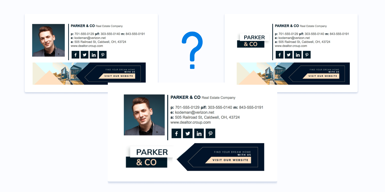
If you represent a personal brand, you should add a photo of yourself to your signature. A headshot with a friendly and relaxed facial expression will be a perfect choice.
People remember visuals better than text. However, those who want to create an email signature often wonder what kind of pictures it is "professional" and can be included in the business email signature.
For finance professionals, such as CFOs and accountants, incorporating appropriate visual elements in email signatures is crucial for establishing trust and professionalism. Utilizing tailored CFO email signature templates and accountant email signature designs can ensure that your signature aligns with industry standards and effectively represents your role.
Here is some advice on choosing a photo for the signature.
Add your professional photo
Adding a personal photo can increase trust and help you build a relationship with customers. But be sure to use only professional, high-quality, and not blurry images.
Don't make the picture too big
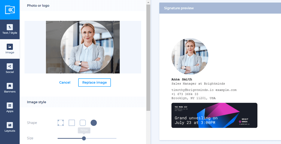
The picture size depends on how wide the rest of your email signature is and how it will fit into the existing design. However, in our email signature generator, we recommend using the optimal size for logos and photos between 100-300 pixels wide. The bigger your image is, the more time it takes for the recipient to preload it.
Don't use inappropriate photos
Be sure to use a professional headshot, preferably made in the same style for each team member, not a selfie or cropped photo.
If you represent a company, using your photo has quite a few advantages as well: it makes your business communication more human, creates trust, and helps you establish a connection with your recipient.
A company logo in an email signature for a business can help raise brand awareness and recognition. Add the logo if you want to advertise your brand better.
While working on our State of Business Email Marketing report, we surveyed more than 750 marketers and business owners and found that they prefer a company logo to a professional headshot. Using company branding across all communication channels makes the company recognizable among all stakeholders and creates consistency.
So, the best solution is to use your photo in your signature (left-aligned) with a smaller company logo (besides the company’s contact info).
How to structure the contact information in an email signature
Even the most complete and optimized signature will look unprofessional if you just put all your information without organizing it properly. Follow the four tips below to keep your signature well-structured.
Limit the amount of contact information. Add only the necessary details. Say, don’t include your Skype name if you don’t use it much.
Arrange information logically. Use your phone number and the company’s web address first and then all the additional details. Ensure your social icons come at the end (unless your social profiles are the primary way to stay in touch with you).
Use dividers. Don’t start every single contact detail from the new line. You can use a vertical line symbol to divide different elements in a row.
Use text color. Take advantage of your brand’s colors to highlight specific content pieces. It might be your or your company’s name or words like “phone” or “email.”
Keep in mind that a great email signature doesn't have to be complicated. The simpler, the better. It should provide basic information about you.
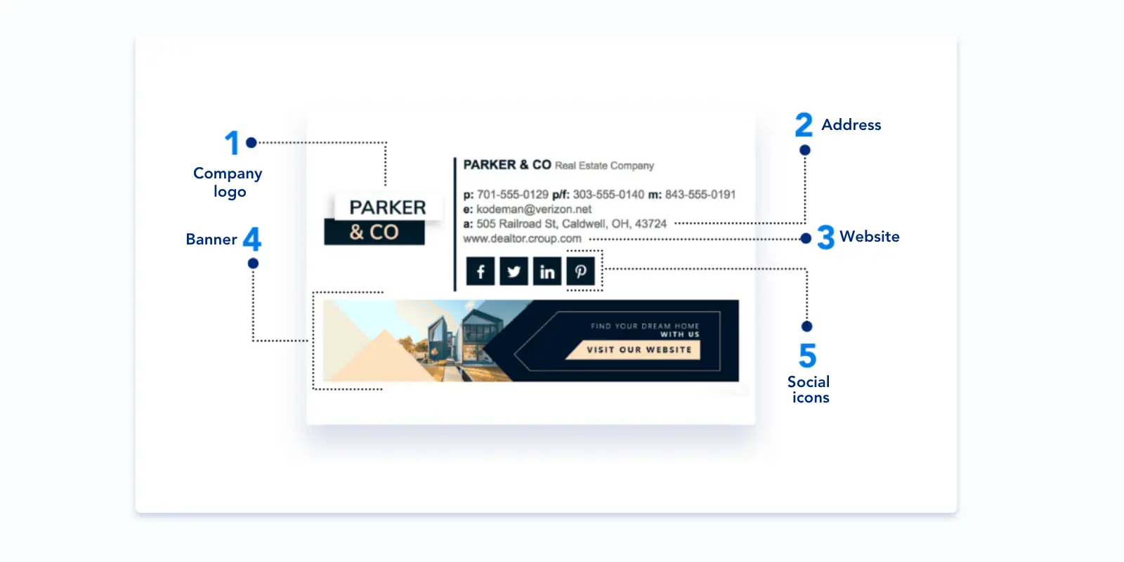
Name
You'd be surprised, but about 30% of email footers don't even have a name, which may negatively affect your company's image.
Position
It's essential to include your job title to let recipients know who they are dealing with and handle their issues.
Company name
If you represent a company, your email footer should have your company's name in it as well.
Company logo
You can also use your corporate logo, but make sure it fits in with the rest of your email footer's aesthetic.
Company's website
If you have a website and are looking for ways to bring traffic to it, consider adding the website URL to your corporate email signature.
Contact information
Email address
Some articles contain advice not to include your email address as recipients can hit "Reply" to answer your message, but some email clients display names rather than email addresses in the "From" field. And when a person forwards your message, recipients will see your name, not the address.
Phone number
Avoid using too many phone numbers. It may be irritating for the reader, especially if they use mobile devices to read your email.
Address
A basic email signature may not provide your address. Before you include your business address, make sure it doesn't overload your signature.
What social media icons should you add to the signature?
If you have well-managed corporate social profiles, then you should link to them in your signature. It will help you drive traffic to these platforms and eventually increase your followers.
Unlike with the website, you cannot just use URLs here. They will make your signature too messy. Add icons instead. They take up very little space, and you can neatly organize them.
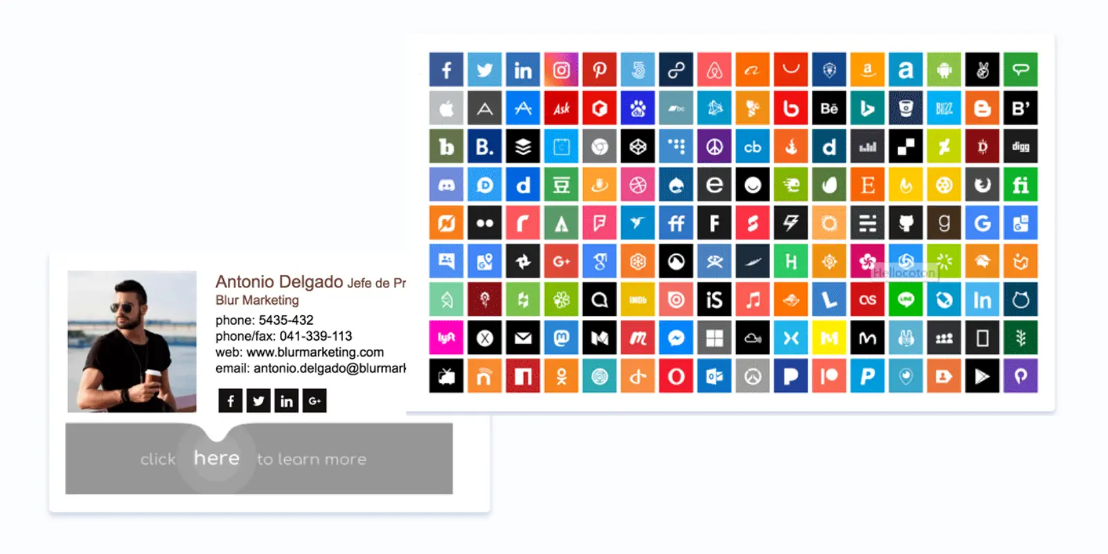
So, which profiles do you need to include in your signature? Certainly not your personal accounts where you connect with friends and family (and share your political views or cat videos). If you're creating an email signature for photographer, you should focus on professional profiles such as your portfolio website, Instagram, or LinkedIn, where potential clients can explore your work and get in touch with you.
If you use Facebook and Twitter professionally, feel free to link to them. You can, however, add your personal LinkedIn. In general, refer your business contacts to your company’s social profiles.
By the way, you can effortlessly create an HTML email signature with social media icons with the help of our signature generation tool.
Why do you need a disclaimer in your email signature?
An email disclaimer (also called an email disclosure, confidentiality notice, footer, or sign-off) is required for a corporate email in many countries. Not to put your company at risk of fines, get the info about legal requirements in your country.
Keep in mind that most well-crafted email signature examples have short and readable disclaimers.

Technically, adding a disclaimer for email signature is often a legal requirement, especially in the EU and North America. The demands, however, may differ from country to country. Typically, you will need to mention the company’s registered address, registration number, and registration authority.
There are different opinions on whether you should include a confidentiality statement in your disclaimer. It could help you in legal disputes in case there are such.
You can either have a universal email signature disclaimer example for the entire company or create separate ones for your departments. In the latter case, you can choose which information to include in it depending on the department’s activities and needs.
Promotional banners in an email signature & how to use them
Adding a promotional banner to your email signature will help your company reach its sales and marketing goals. And if you thought of those annoying animated ads that used to distract you from content on many websites, it’s time to change your idea of a banner.
Look at an example of an email signature banner below. It consists only of a background photo, a hashtag, and a website address and is quite minimal.
If you want your banner to work for you (drive traffic, generate leads, increase sales, etc.), follow our three banner-related tips.
1. Make signature banners eye-catching
Use vivid images, short and to-the-point phrases, and your brand colors, with designs created using Recraft v3.
2. Keep it simple.
Your banner doesn’t need to be too big or too bright to get noticed. Make it align with your signature and message.
3. Add a CTA.
A clear CTA will help you reach your goal. Whether it is to read your latest article or sign up for a webinar, say so in your banner. Otherwise, it might be pretty useless.
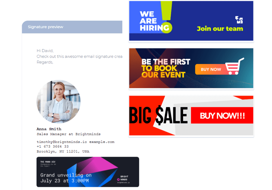
Banners in email signatures are great to show your expertise and add to your promotion. What should you insert in your banner?
- Use alert words
Consider using alert words that encourage users to click on your banners. For instance, "Lifetime access to over 1000 video courses," "Get our best-performing ad templates," and "Top 3 undiscovered food photography tricks." - Offer something valuable
Give people valuable eBooks, checklists, videos, tips, and how-tos. - Invite recipients to an event
Notify people about the upcoming event they can attend. Also, be sure to provide information like what, when, where, etc. - Introduce a sale offer
You might also want to add promotional banners to your email footer to promote an upcoming sale. - Showcase your company's awards
Banners can help you demonstrate your expertise so your potential customers know you are someone they can rely on. - Make company-wide announcements
Each email sent by employees internally presents an opportunity to share your internal news & announcements, marketing updates, onboarding practices, and so on. - Introduce new products
You can use banners to advertise your new products. - Congratulate addresses on holidays
Many companies add banners to their email footers at Christmas time, wishing their readers a great holiday season.
Add call-to-action buttons
When you check out great signature examples, you'll notice that the CTAs in them are very simple, not too pushy, and usually aligned with the theme of the message.
Read on to see several ideas for prompting action from your email readers.
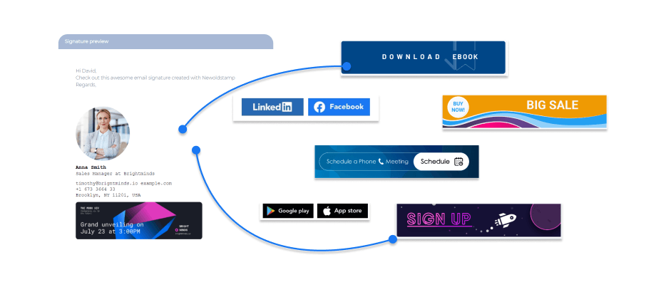
- Link your social media profiles to buttons
Condense long social media links into short and easy words or phrases that instantly bring the recipients where they need to be at the click of a mouse. - Share your AppStore or Google Play apps with buttons
Let anyone you are emailing with see and download your apps. - Invite recipients to sign up
By placing a hyperlinked call to action in your email footer, you can turn every reader into a subscriber. - Encourage people to call you
Tell people you are open to communicating with them. - Add appointment schedulers
Give recipients the option to book an appointment with you quickly. - Promote your product demo
Include a link to a video demonstrating your product/service or offer to schedule a demo. - Let addresses subscribe to your blog
Well-written and value-packed blog posts may convince the recipient that the product or service you offer is credible and trustworthy. Including a blog post link in your online business card design can be an excellent way to showcase your expertise.
Mistakes to avoid in an email signature
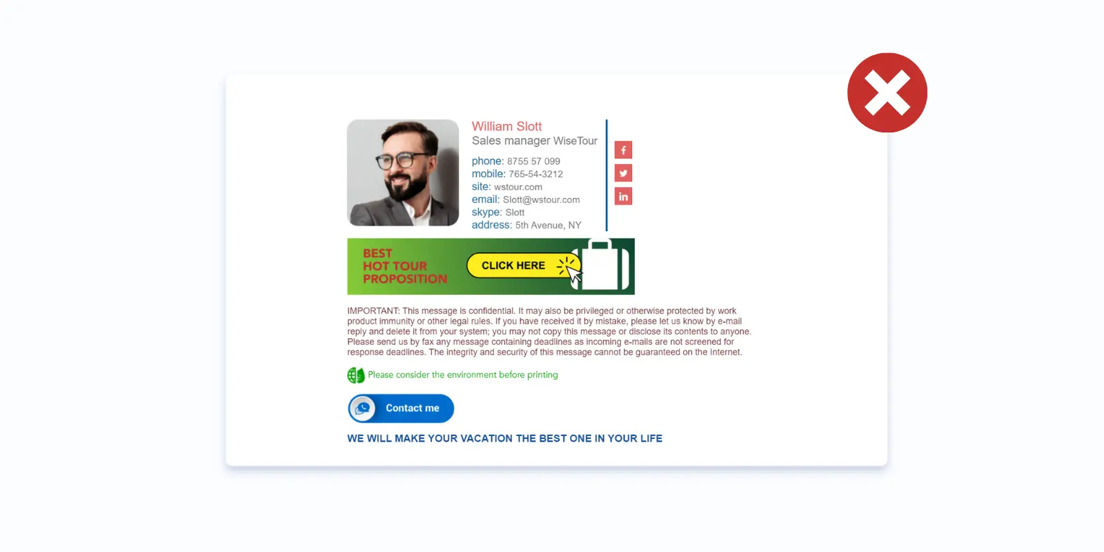
Now that you know how to build your email signature and what elements to use in it let's look at what you SHOULD NOT do. Meet the seven most common mistakes in email sign-offs.
Invalid contact information
Your company might change its address or phone number. Once it happens, make sure you've updated the relevant information in all your communication channels, including your email signature.
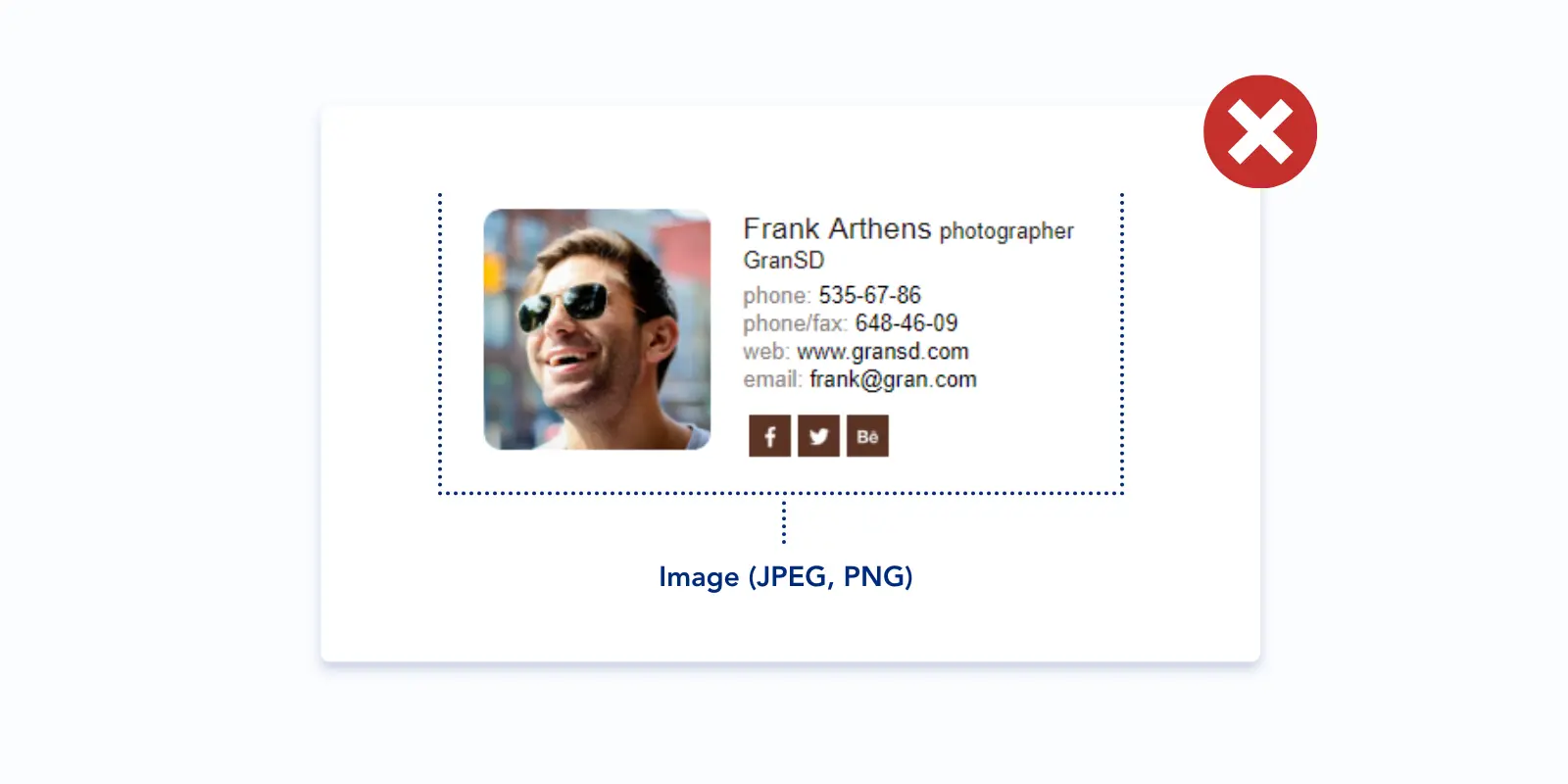
Using images as a signature
Never use images as a signature. In the best-case scenario, your recipient won't be able to call your phone with one click or copy your website address. Your signature will show as an attachment in the worst-case scenario, which will trigger your recipient's spam filter. Use HTML instead.
Using too many colors
A sea of colors in your email signature might seem like a designer dream, but for your recipient, it's more of a visual headache. Imagine you're trying to read their message, but all you see are clashing colors fighting for attention. Not exactly a winning first impression.
Instead, pick a single standout color and pair it with a cool grey or black for the text. This creates a clean look that lets your message shine.
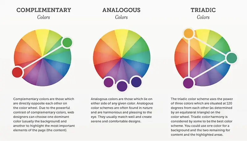
image source: crazyegg
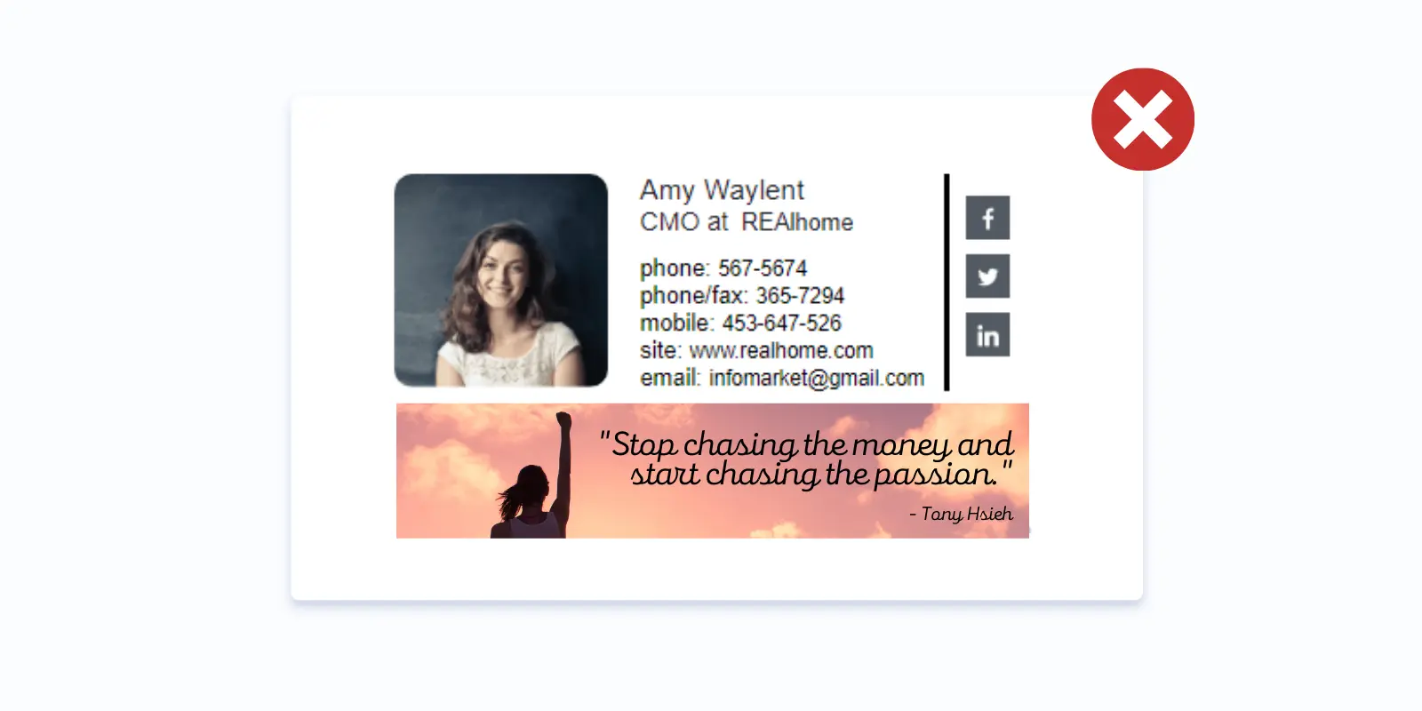
Adding quotes to your business email signature
Inspirational quotes don't serve any purpose in business correspondence. And if you relate to a particular quote, this doesn't mean that your collector does too. Humor or specific ideologies within a quote could potentially offend or distract recipients.
Alternatives to consider:
- Company slogan: Include your company's tagline or mission statement. This reinforces your brand identity and conveys professionalism.
- Call to action: Use your signature to subtly encourage recipients to connect with you on social media or visit your company website.
Using low-quality images
Remember that almost everyone now has 4k or Retina screens on their phones. Make sure your image is small but of very high quality. Test it on desktop and mobile devices before utilizing it in your emails.
Inserting funny GIFs into a professional signature
Funny animated GIFs in email footers seem like an excellent idea, but unfortunately, they won't work on all email clients. Plus, your email recipients might think your GIFs are unprofessional.
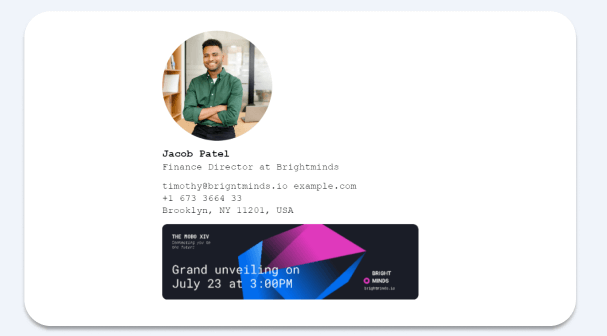
Making your photo take most of the signature's space
A common graphic element to use in business signatures is a headshot of the sender because it helps build more of a personal relationship and create a feeling of trustworthiness. However, there is one common rookie mistake you should avoid. Don’t choose too large photos of yourself in your email footer. Think about it, how would you feel if you received a life-size version of some person in your inbox each time you talk with them via email? Our best guess, is it could be a little startling unless you are in love with that person.
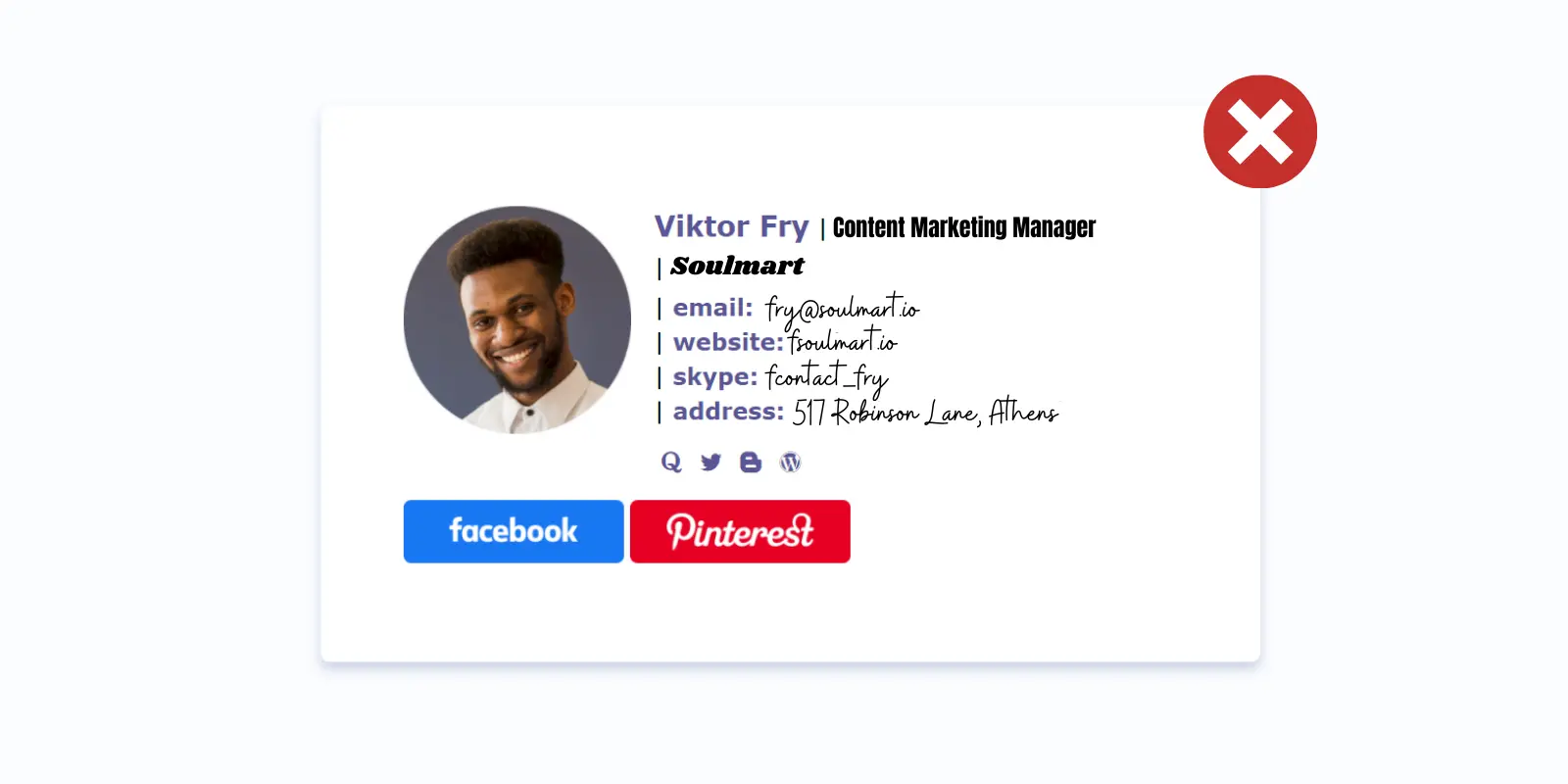
Using different fonts
A signature with many various fonts will look just the same as one with too many colors. It will be distracting and amateurish. Stick to your corporate fonts instead.
Not making your signature mobile-friendly
With so many people reading their emails on mobile these days, it would be inexcusable not to make it responsive. To make sure your signature looks well everywhere, use an HTML email signatures generator and test it before making it live.
Adding too many social icons
Your email footer will look cluttered if you add an icon for every social media network your organization uses. We recommend including only the channels that are most regularly updated.
![]()
Allow employees to create signatures by themselves
One of the simplest ways to harm your company's image is to ask your employees to get creative and design their sigs for emails by themselves. It's a certainty they won't agree on a standardized email signature template. Goodbye, brand consistency, hello, chaos!
Making your signature too long
When it comes to choosing what information you should include, stick to the rule "less is more." Keep in mind that the best email signature examples are about five lines of text.
Ignoring email signature size
If you know what devices your audience commonly uses, it would be easier for you to get your signature displayed in the right way. For instance, mobile users should make it no more significant than 320px (pixels) wide. For desktop users, an email footer with a dimension of 600px wide would work perfectly.
How to manage email signatures for the whole team?
Whether you're a freelancer, small business, or large organization, your signature design should reflect your business's professional standards. And while in the case of freelancers and small teams, it may be pretty easy to create consistent and perfectly branded signatures, crafting and managing multiple email footers for a large number of employees may become a complex task. What are the things to consider?
Use one email signature template for all team
Consistency is a number one priority for your email signature template. Inconsistent signatures give the impression of chaos and unprofessionalism.
.png?1712058166)
Create different signatures for different departments
So you decided to set up email signatures across the entire company and understood that they need to be consistent to represent your brand in the best possible light. That is right. However, that doesn't mean that different departments can't have additional information included. For instance, your marketing team is more likely to need social media links in their signatures than employees who manage finances.
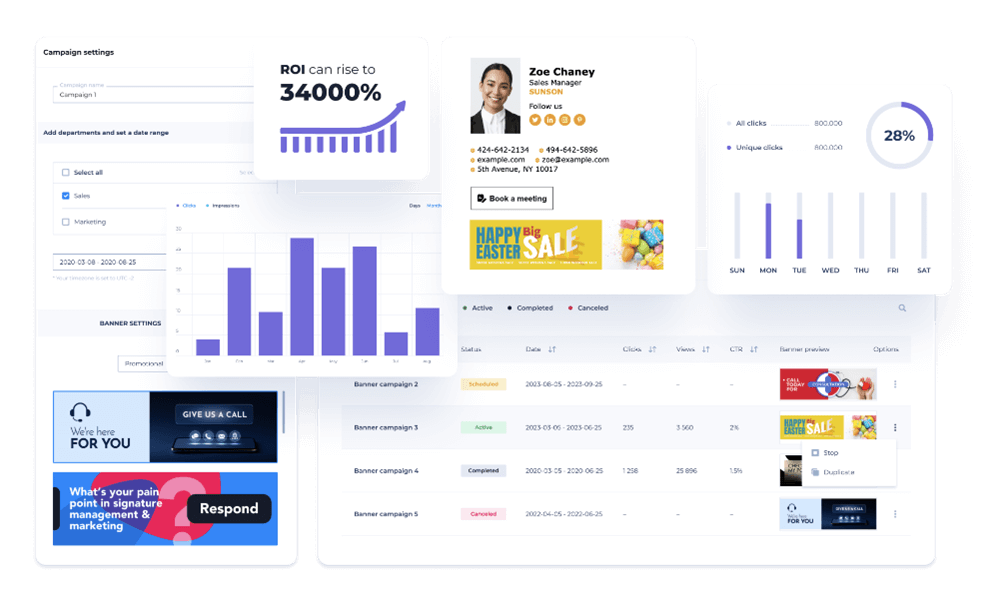
Create marketing campaigns in your email signatures
Use your email footer to support your marketing campaigns. For example, add links to social media, links to the latest content, links to webinars or events you will attend, and a newsletter subscription link.
Use email signature management software
To be sure your signature will be displayed correctly on various devices and email clients, use paid or free email signature generators. It offers different templates and good technical support, created by professional designers, and is compatible with almost any email client. Furthermore, you can make multiple signatures faster because you can create one master sig and then upload a file with contact data, and the system will work on signatures by itself.
What problems can an online email signature generator solve?
Creating identical email signatures for all your departments and employees
Your employees send dozens if not hundreds of emails every day. This is a great opportunity to promote and spread your company’s values in every email. That is why it is important to have corporate signatures for all employees. However, bear in mind that it won't be effective if they create these signatures on their own. It is recommended to create an official, standardized business email template for all the signatures coming from your company’s mailboxes.
Having to tell your employees to change their signatures manually all the time
Email signature generators let you centrally manage and deploy signatures for any scope of mailboxes in your company. This means you don’t need to control if the employee installed or updated the signature on time.
Having to involve design, IT, and marketing teams to make appealing email signatures
Let your people spend less time fixing problems with signatures and more time performing their regular duties.
Spending too much time creating and editing email footers
With email signature template generators, you will save a lot of time because you won't need to hire a designer, test signatures, re-configure, and perfect them from time to time.
Standardizing signatures for different email clients
Email footers created with signature generators can be installed in nearly all major email clients including Gmail, Apple Mail, Outlook, iOS, and more.
Furthermore, you can be sure that your signatures will look good in all those email clients.
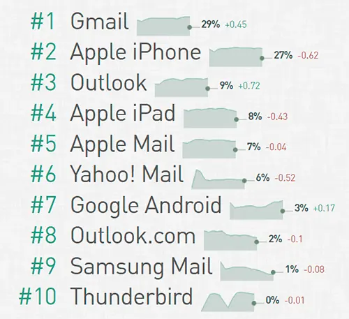
image source: emailclientmarketshare
Updating all the signatures regularly
You can update your signatures for the holidays, special events, or sales across the entire organization with just a few clicks.
Using email signatures as a marketing channel
Banners in email signatures, which can be regularly updated, can be an excellent distribution channel to promote your company’s most important events, content, news, product demos, and more.
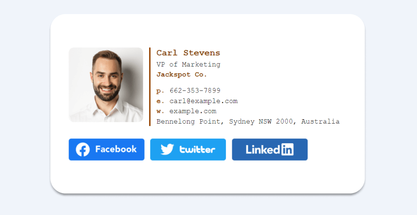
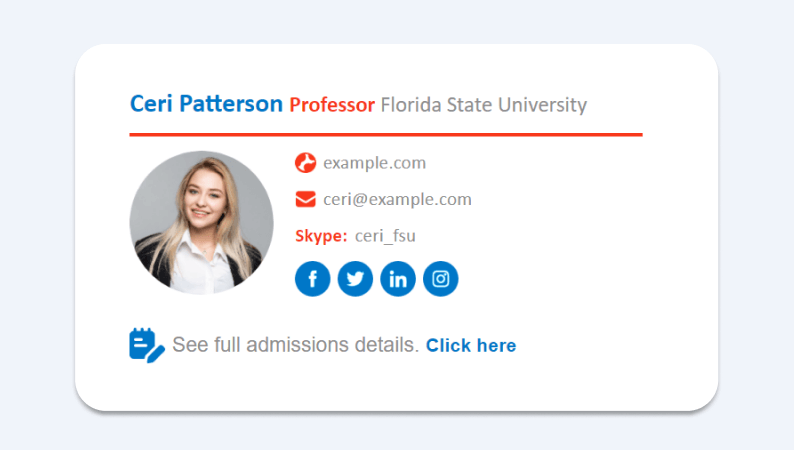
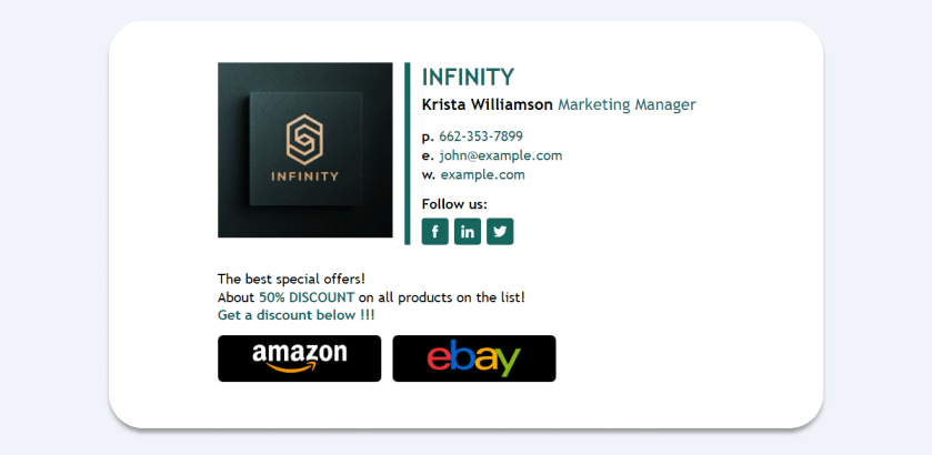
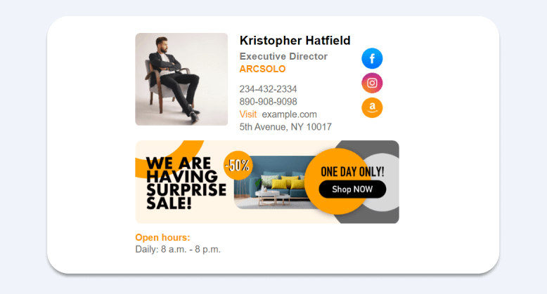
The most powerful business email signature format examples
And lastly, we want to share some great email signature templates to inspire you. Enjoy!
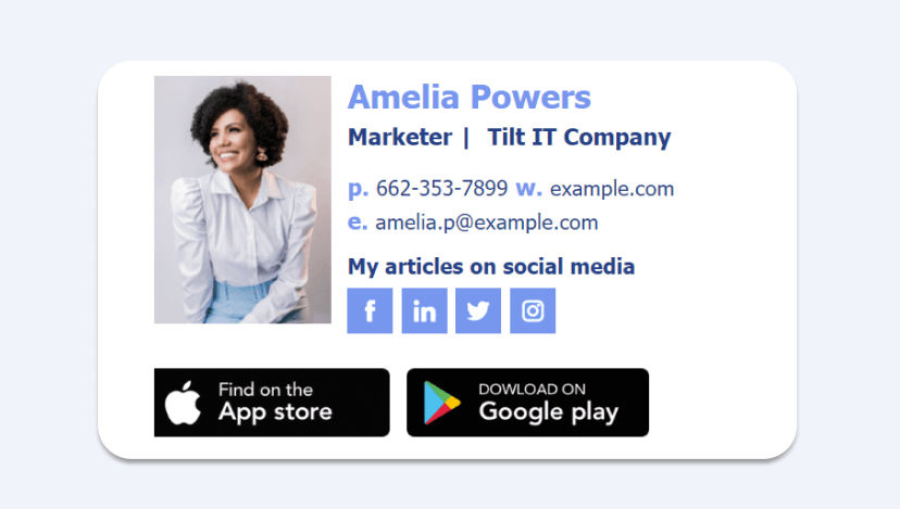


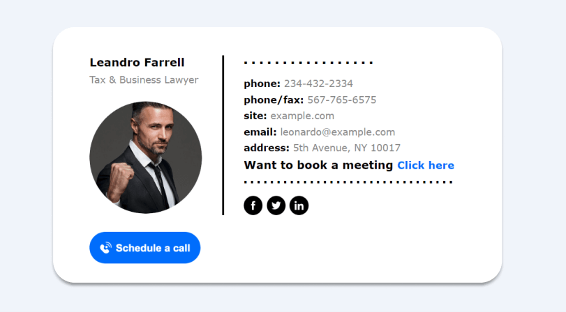

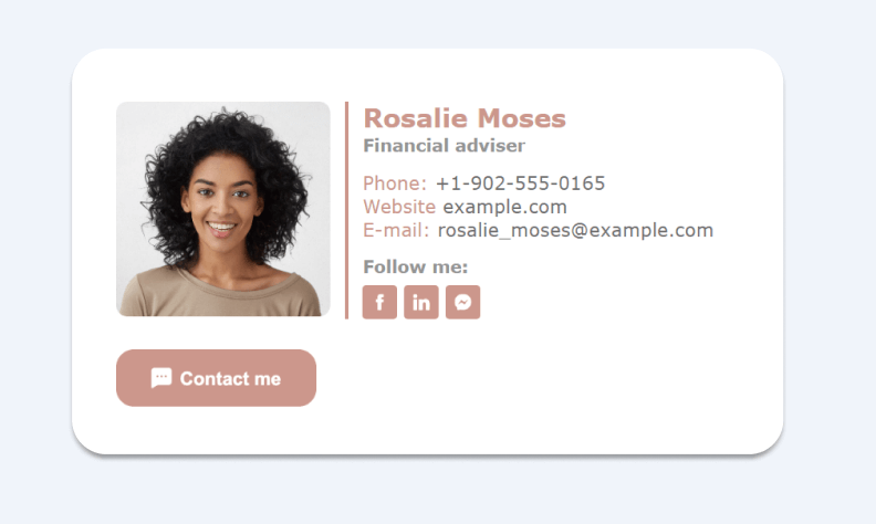
Powered by Newoldstamp
Frequently Asked Questions about Business Email Signatures
Why should I include both my personal and company names?
Building trust is key in business communication. When you include both your name and your company's name in your email signature, it shows recipients who you are and who you represent. This allows them to easily research your company if they're unfamiliar with it.
Related: To learn how to create impactful emails that convey professionalism and drive results, see our guide on Business Email Examples: The Elements Of A Professional Formal Email.
Should I add a company logo or a photo?
Images can grab attention! Adding a company logo reinforces your brand and helps with recognition. A headshot can add a personal touch, letting recipients know there's a real person behind the email.
Related: For tips on optimizing your email format for business, explore The Comprehensive Guide To Email Format For Business to Get Replies ASAP.
What contact information should I include?
Keep it essential! Your name, title, company name, website, and phone number are enough for most communications.
How many social media buttons should I add?
Focus on quality over quantity! Use a maximum of four icons, prioritizing the platforms you're most active on.
Can I use a banner for promotions?
Absolutely! Banners can turn your signature into a marketing tool. Promote events, blog posts, or special offers.
Related: “24 Perfect Moments to Use Email Signature Banner to Boost Your Business”
When do I need legal disclaimers?
Companies often use signature disclaimers to protect the information they share in emails. Consult your legal department for guidance.
How should I design my email signature content?
- Colors: Use your company's colors and fonts (2-3 max).
- Organization: Prioritize key elements like name, title, phone number, and email. Use a formula like name > title > address > phone number > email > website > social media.
- Length: Keep it short and sweet (3-4 lines).
- Social media: Limit buttons to 4 or consider removing less used ones if space is tight.
- Image size: Keep logos and headshots small to avoid download delays and mobile display issues.
- Mobile-friendliness: Ensure your signature displays well on smartphones.
Conclusion
To appear professional in your business communication, always have a signature at the end of your email. When creating one, have the necessary structure in mind. Apart from your name and corporate contact details, be sure to use images. All in all, people are visual beings. Pick a friendly photo of yourself to personalize your messages and establish a trustful connection with your recipients. Include social media icons if you have corporate profiles. Also, don’t forget about a legally required disclaimer with your company’s registration details. Add a nice-looking banner to help your business reach its KPIs. Arrange all these components logically and track your progress.


