The Best Sales Call to Action Examples to Improve Your Conversion Rates
1. What is a call to action?
2. Types of sales calls to action
3. Best tips for creating good calls to action
4. Great Call to Action Examples
5. How to test your CTA
Your content marketing doesn't work for you? Clients visit your landing pages, like posts on social media, read articles on the blog, but never leave comments or buy from you? Why would that be? If you have ever asked this question, keep on reading.
Count how many offers you see every day. Advertising on social media, dozens of emails in the mailbox, ads on websites, billboards on the way to work/home. Head spins from countless “buy,” “register,” “sign up for free,” and many other calls to action. Sometimes you even react to such ads with anger and irritation. That’s how your clients might feel too. But if you want your landing page, blog post or email to be viewed with the thought, “I want to buy it,” “I've been waiting for this article for a month,” “How did they know that I needed this?!”, "Did they just read my mind?”, you need to use some well-thought-out calls to action.
via GIPHY
What is a call to action?
A call to action (also known as a CTA) is an image or text which is aimed at getting the audience to take a specific action. An example of a CTA is “Download a Free Trial.”
Types of sales calls to action

-
Encouragement calls to action
Sometimes a user just needs an extra push to make a decision. You can increase the chances of the customer taking the actions you want them to take if you provide them with an incentive. For instance, if you are asking people to download your app, you can emphasize that it’s free. Encouragement call to action phrases examples are “Get started (it's free),” “Save now,” “Sign up in 30 seconds,” “Shop now. Get 30% off,” etc.
-
Lead capturing calls to action
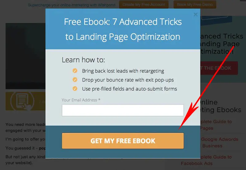
Many businesses use CTAs to expand their list of contacts. Persuading people to volunteer their contact data is critical to continuing the conversation, and an sms popup can be a simple way to capture phone numbers with clear consent. A great approach when collecting emails is to offer free, relevant, and valuable content that prospects might be interested in. Some effective call to action examples are “Download a free eBook,” “Subscribe for updates,” “Get it now,” “Schedule a free demo,” “Ask a question,” etc.
-
Educational calls to action
A lot of companies want to educate their audience on some concepts before they bring people to the purchase. They offer free video tutorials, webinars, eBooks, reports, and other educational info. Great call to action examples to use for education are “I need it now!”, “I want that report!”, “Join the webinar,” “Learn how to get 10k Instagram followers,” etc.
You may also like: “How to Prospect for Sales and Close Your Deals Faster.”
Best tips for creating good calls to action
Before you start creating your calls to action, we'd like to drop some tips on how to make the CTAs as persuasive as possible.
-
Use white space
Increasing the amount of white space around your call to action is a great hack to draw prospects’ attention and make them click through. Surrounded by whitespace, the CTA will stand out more.
-
Make your CTAs connected to the content
To make it clear to your audience what you want them to do, your CTA should reflect the message of the content. Let's suppose, you write a blog post "Five New Ways to Get More (Real!) Instagram Followers in 2025," and want people to download your guide about increasing the number of Instagram followers, don't simply say "Download Our Free Guide," but use something more descriptive and reminiscent of the content above. For instance, "Grow to 30k + Instagram followers with this free guide."
-
Choose CTA phrases according to the sales funnel
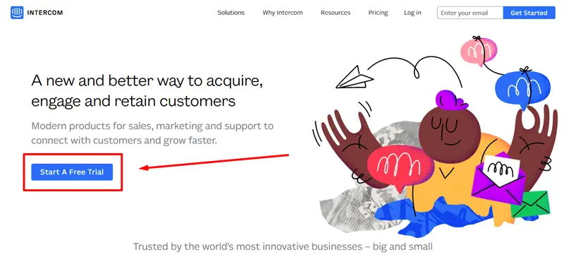
A call to action can refer to different requests depending on a sales funnel stage a customer is going through. For example, your CTAs for the Evaluation/Interest stage might look like “Download a Free eBook,” “Sign-up for our newsletter,” etc. And your CTAs for the Closing/Purchase stage might look like “Add to Cart,” “Buy now,” etc.
source: intercom
-
Make your CTA easy to find from the first glance
Keep in mind that creating a colorful CTA that contrasts with the color of the page is an excellent way to draw the user’s attention. Also, make the font size large enough to drive attention.
Email signatures are also an effective place to include CTAs. A well-designed email signature can feature a clickable button or banner, directing recipients to special offers, newsletters, or resources. By using professional email signature software, you can ensure consistent branding while making your calls-to-action easily accessible in all communications.
-
Choose positive or negative intent for your CTAs
You might also choose to ask people not to click the button or not to download the report hoping they would act the opposite way. However, keep in mind that most users feel more optimistic when they see calls to action with positive intent like, “Yes, I want that free report!”
-
Show there is no obligation behind the CTA
Let users know that there is zero risk, no obligation, or not even a credit card required. For example, "Start My 30-day Free Trial."
-
Make your call to action understandable and clear
If you don't want to confuse your clients, try to avoid using CTAs like “Submit” or "Go" because that doesn’t tell users what door they are entering. Instead, give them some more details, because people prefer to know where they are going and what is going to happen. Use something like “Get my Free Consultation” or “Start My Free Trial.”
-
Stress the benefits in the CTA phrase
Stating a clear benefit that the reader will get from completing the action is an effective way to get them to click. Here are a few examples of calls to action that reflect a benefit: “Get My eBook,” “Join the Fun,” “Get My 50% off Coupon.”
source: Wishpond
You may also like: “Five Vital CTA Elements for Your Email to Kick off Your Campaign With a Bang.”
Great Call to Action Examples
Now let's look at how it looks like in practice. Each example that we selected will come with an explanation of what makes it such a good CTA.
-
Email marketing call to action examples
In this email marketing campaign, a lot of elements help LOFT impress their subscribers by creating a wow effect. But since we need to focus on CTAs, pay attention that the LOFT's call to action button is short & direct, its color grabs the eye, and the placement is also well-thought-out.

-
Website call to action
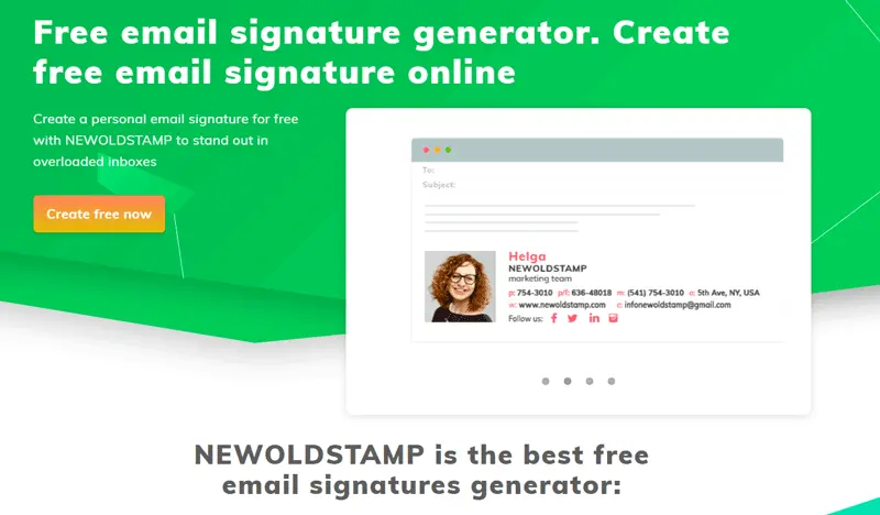
Why is the Newoldstamp's call to action good?
#2 The button has an eye-catching color, plus the button color contrasts with the background color.
#3 It is descriptive and clear (explains to users that the service is free).
-
E-commerce call to action examples
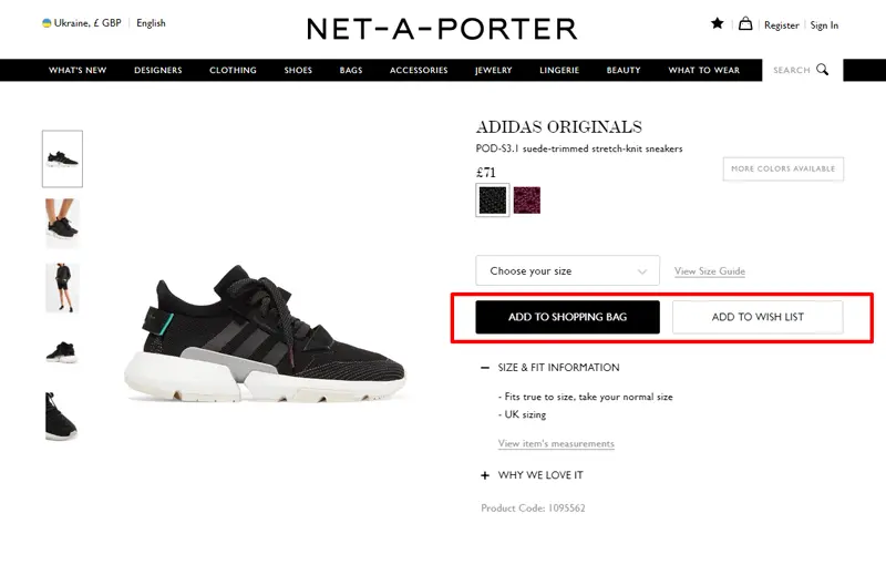
What is could be more important for a seller, if a user buys a product or just adds it to the wishlist? Net-a-porter wants us to add the sandals to shopping bag rather than to the wishlist. That is why they made the “Add to shopping bag” button more attention-grabbing.
source: net-a-porter
You may also like: “E-commerce Email Marketing Guide: 12 Hacks to Kick off Your Sales.”
-
Calls to action in newsletters
The CTA is bold and attention-grabbing with good use of color, contrast, and font size. The orange box stands out from the white background.

source: Grammarly
How to test your CTA
Like many other marketing strategies, testing different calls to action ensures you are getting maximum results.
-
Use Events in Google Analytics
Do your clients want to “Subscribe today” or “Be the first to know about new arrivals”? Is a big orange button on a white background promoting your sale more effective than a text link in the sidebar? Try using event tracking in Google Analytics to help answer these kinds of questions. Read how to set up Google event tracking.
![]()
source: Google adwords
-
Use Heat Maps
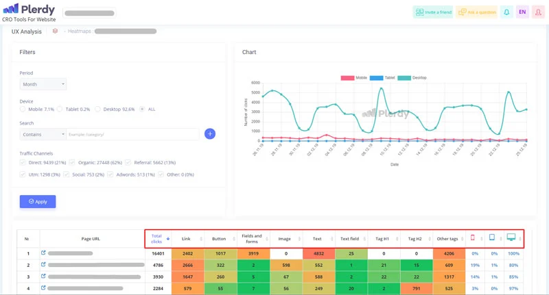
Heatmap tools can be incredibly helpful when improving the clickability of your sales call to action phrases. These tools will let you find out what people are looking at and what things they are missing. You will find out where the actual click occurred, how far down the page the reader scrolled, where the user's eyes focused upon first viewing an image/CTA. From there you can add, remove, and adjust whatever you need to increase the effectiveness of each CTA used.
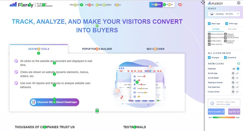
Plerdy Heatmap tool can help you to analyze user behavior and see which elements of the page are the most-clicked by users.
Conclusion
Unfortunately, there is no single formula for calls to action that can magically convince most of your leads to convert, but if you want to know your audience and their preferences better, experiment with different CTAs, and test variations.


