
The Ultimate Guide to Email Signature Call-to-Action [Updated 2025]
1. What is an email signature call-to-action?
2. Email signature call-to-action types
3. Creating a CTA email signature that generates leads
4. How to optimize your email signature call-to-action
5. Email signature CTA ideas
Every email with the right email signature is a chance to drive highly converting traffic. In this context, the essential part of the email signature is a call-to-action (CTA).
In this article, I’ll tell you how the CTA in your email footer can help get a higher click-through rate (CTR).
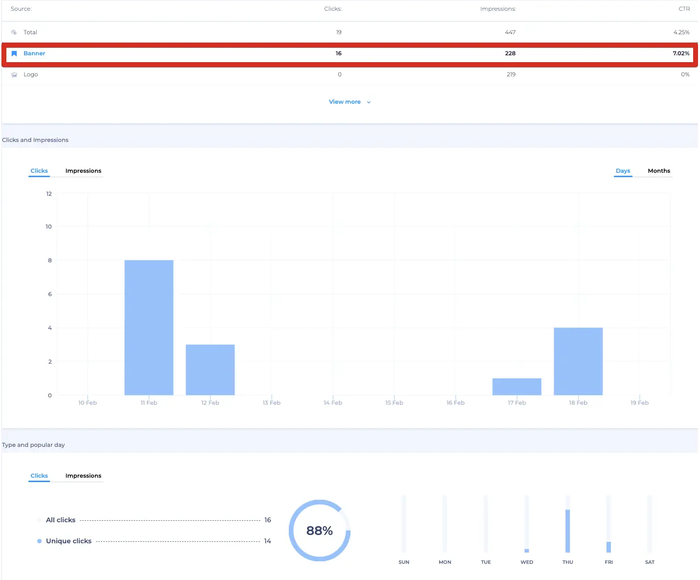
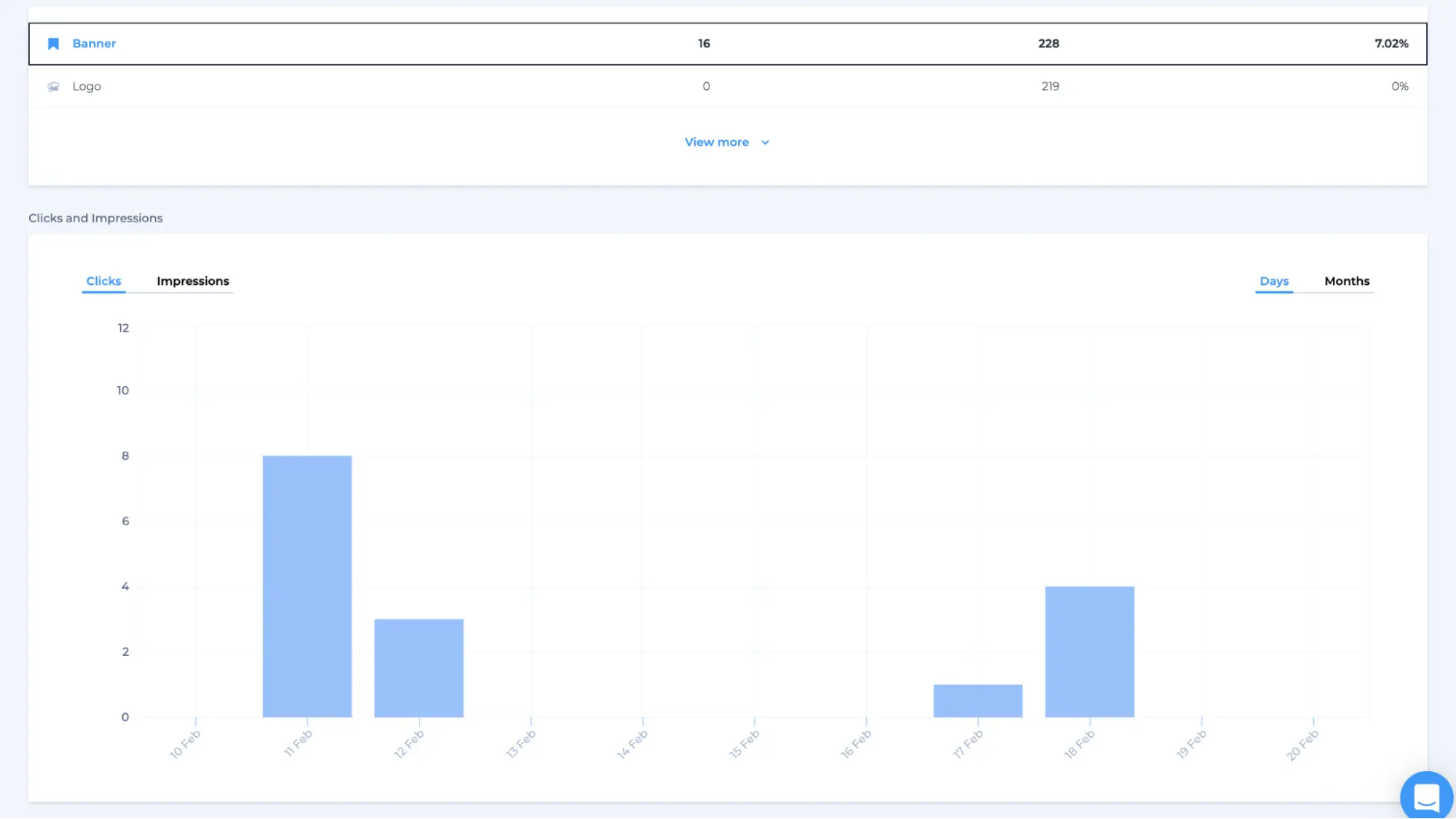
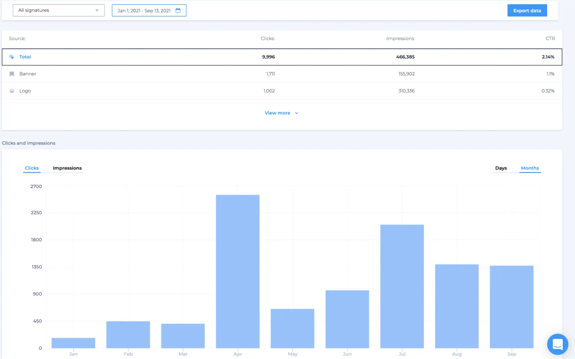
Below are the results of our analytics showing the ratio of recipients who click on a CTA link in our email to the number of total impressions. As you can see, the right CTA resulted in a CTR of as much as 7%.
After reading this article, you will:
- Understand how to create high performing CTAs for email signatures
- Know the types of email signature call-to-actions
- Have ideas on how to use your signatures for marketing.
Click here to create email signatures with powerful call-to-action
What is an email signature call-to-action?
A CTA email signature is an email footer with a clickable element. This can be a button, a promotional banner, a link, or a video. A good CTA in an email signature entices recipients to take action aligned to your business goals.
To measure the performance of your CTA, you need to use a tracking code. That’s why I recommend using professional email signature software to create an email footer that works and contributes to your marketing efforts. Crafting a compelling CTA email signature is pivotal for driving engagement. Enhance yours with clickable elements such as buttons or banners. For precise performance tracking, opt for professional email signature software. Utilize QR codes generated using a secure QR code generator to monitor CTA effectiveness for optimizing marketing strategies.
Email signature call-to-action types
The CTAs range from offers like a free download to links that send recipients to landing page fill-out forms. You can use buttons, promotion banners, and inline CTAs. Now, let’s have a closer look at some examples of different CTA types you can incorporate into your email footer.
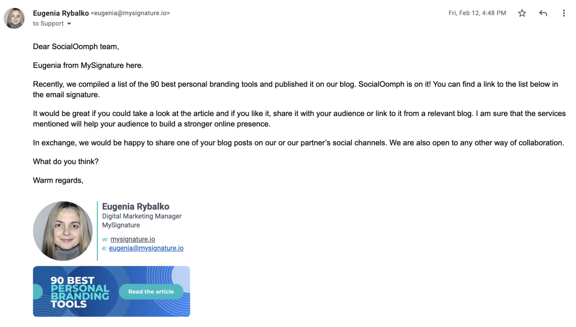
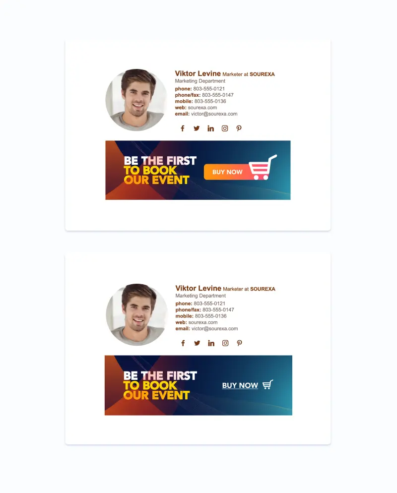
Promotional email signature banners
Banners are probably the most attention-grabbing option you have. The banner catches the eye of the recipient already at the point when they open the email. Due to this fact, they read the banner first. And only after that, they move on to the email. That’s why the banner should support the email context.
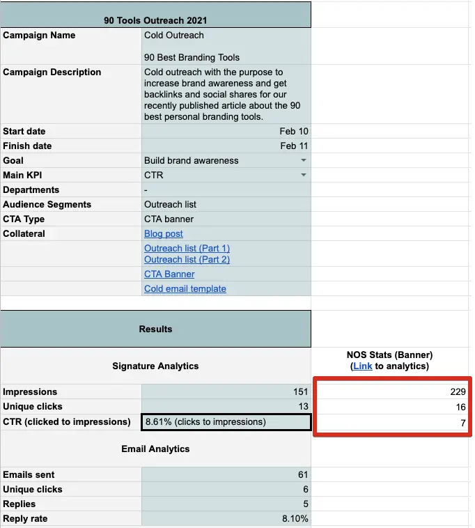
Below, you can see an example of our cold outreach campaign with the purpose to increase brand awareness and get backlinks & social shares for our recently published article.
Here’re the results of implementing a CTA banner:
Emails sent - 61
Banner impressions - 228
Banner clicks - 16
CTR impr/clicks - 7.02%
Conversion sent/clicks - 26%
Want to know how we tracked this?
When we run banner campaigns, we always schedule automatic updates in Newoldstamp. There is an option to simply upload a promotional banner, add the destination URL, choose departments for which you want to add the banner (e.g., sales or technical support), and set the date. Newoldstamp will gather all the analytics to measure campaign performance.
Buttons
Although you can’t say much when using buttons, they’re the most common type of CTA in email signatures and serve better as a long-term strategy.
According to stats given by Campaign Monitor, having a button rather than a hyperlink can increase your conversion rates by as much as 28%.
To make your CTA buttons work, be sure they’re clean and straightforward.
Newoldstamp’s CTA buttons perform the following actions:
- Grow your social media following
- Increase the number of your podcast listeners
- Proof your expertise (review platforms) or gather new reviews
- Share your app on the AppleStore or Google Play
- Share your shop on Amazon or eBay.

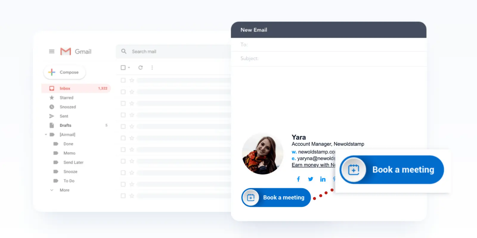
Inline call-to-actions
An inline CTA in an email signature is a simple text that can contain the icon and have, for instance, a different color. Being less visually active than banners and buttons, inline CTAs are still super effective.
For example, we added a simple CTA link to our sales manager’s email signature offering to “Book a demo.” The result surpassed our expectations.
20% out of 216 people who clicked on a link booked a demo with us. So having to pay about $50 per year for a signature, we generated 341 times more revenue!
Creating a CTA email signature that generates leads
You might be shocked, but the average office worker sends out 40 business emails and receives 90 of them each day. Now multiply this by the number of employees. That could be several hundred or even thousands of business letters per day!
Each of those emails could be carrying a lead-generating CTA in an email footer, attracting new potential customers into your business.
So, how do you make your email signature CTA generate more leads?
Keep your CTA message simple, clear, and fit the context
Too long and too wordy CTAs aren’t effective. The longer your copy is, the more time a recipient has to consider before clicking. That’s why your email signature CTA should be short and to the point. At Newoldstamp, we aim to keep our CTAs about 2-4 words long.
I also recommend avoiding generic CTAs such as “click here” or “sign up.” When you proceed with the generic text, you’re missing a chance to get more clicks. Furthermore, the above-mentioned CTAs feel like recipients need to do some work. Instead, your lead should easily understand what they will get after clicking on the button. For example, you can say, “Grab my socks,” instead of “Buy now.”
Also, make sure that your CTA is connected with the landing page so that users get what they expect. A CTA can be integrated into a QR code that you just scan to receive a discount, promotion, etc. You can use any best QR code generator tools online.
For example, let’s compare the following CTAs:
“Test it out” and “See demo.”
The second CTA performs better because it meets the user’s expectations by telling them exactly what they’re going to get.
Add action words
Proactive words in email signature CTAs may increase clicks. I recommend using imperative verbs to stimulate recipients into action. The phrase should tell the reader exactly what to do. For example, “Activate,” “grab,” “get my free X.”
It’s possible to further encourage action by provoking positive rather than negative emotions. Look at the next example.
source: Uxmovement
We often see the word “Submit” on web forms. Users fill in their details and click the “Submit” button. But we don’t want our customers to submit anything. The word is passive and doesn’t reward their action.
Switching to “Send” can change the way recipients feel.
Make your signature CTA stand out
While the words are an essential part of a good CTA, you shouldn’t forget about other factors that can make it stand out. CTA’s colors, fonts, and other visual elements can influence conversions.
What’s about the color? If, for example, your CTA text color is low-contrast against your button color, visibility will be poor. But when you increase the contrast between the text and button colors, your conversions will go up. People will start seeing your text clearly.
The next tip is related to the white space around your CTAs. Add some white space to create a visual break and draw the recipient’s attention right where you want it.
On top of that, consider using GIFs If you want to make your CTA even more attractive.
Use I/me instead of You/Your
Did you know that pronouns affect conversion rates? During the experiment, ContentVerve found out that the first-person phrasing worked better than the third-person phrasing. The CTA “Start my free 30-day trial” resulted in a 90% increase in CTR compared to “Start your free 30-day trial.”

source: GoSquared
Follow branding guidelines
Though getting creative is fine when working on your email signature, ensure that the results easily associate with your brand. For instance, when you see an apple with a bite or a combination of silver, black and white colors, you can easily recognize that we’re talking about Apple.
So be sure to follow your brand’s color, font, graphic elements, and tone of voice so that people can easily recognize you.
How to optimize your email signature call-to-action
In this paragraph, you’ll learn how you can make the most out of your email signatures’ CTAs by optimizing them.
Gather analytics
This step will enable you to see if you meet the goals you set. For example, you may want to increase traffic to your blog or get more demo bookings. This should be reflected in your email signature CTA (e.g., “Get free templates,” or “Book my free demo.”)
But how do you measure if your CTA is working?
Advanced signature management tools like Newoldstamp have integrated signature analytics. For example, Newoldstamp analytics generates reports on signature and banner campaigns. You can track impressions, clicks, and CTRs of all elements.
You might also want to integrate your signature data into Google Analytics reports by adding UTM parameters to the links in your signature. This is also possible with Newoldstamp.
Find the best CTA type
Earlier in this article, I covered the most common types of CTAs. Some might work for you, others not. Try to experiment with CTAs in email signatures. The choice will depend on the goal and type of content. For example, it’s logical to try bright and attention-grabbing banners for outreach campaigns. At the same time, an inline CTA with links to your calendar might work better than a banner when you email current customers to help them solve some issues.
Test how signature CTA looks in other email clients and devices
If you have a custom-coded HTML email signature, it’s better to make sure your email footer looks the same on any device that potential customers will use to view it. This includes various laptops, mobile phones, tablets, and other devices. Furthermore, your signature’s appearance might change depending on email clients. The Litmus email testing tool is one of the best ways to become aware of how your emails look in your recipients’ inboxes.
But suppose you use email signature software for managing your company signatures. In that case, you’re on the safe side as most of the vendors, including Newoldstamp, spend much effort to test templates and offer the best solution.
Be careful with images
Adding an image to your email footer can make your message look more professional or more personal. But there are also some caveats to this practice.
- Always use the Alt text for your images. In case of blocked images or a slow Internet connection, the recipient will see descriptions of what’s on this picture.
- Opt for PNG format rather than JPG. It offers better image quality with less file weight.
- Pay attention to image size as the file of the email signature shouldn’t exceed 15kb (when optimized for web).
Email signature CTA ideas
Do your company email footers still only include team members’ contact information and a logo? Then I recommend you start exploring the marketing opportunities email signatures can offer. Below are a few ideas you can try in your next campaign.

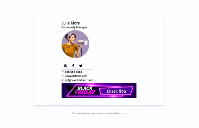
Highlight some discounts or special offers
Use email signatures to share information about discounts or special offers. For example, the signature presented below promotes a Black Friday sale. If you still have no email signature to support your next big sale, you can create one in a few minutes by using Newoldstamp’s templates.
Share your recent blog posts
According to statistics, 93% of marketers say that email is the preferred medium to distribute their content. And an email signature is an often-underestimated channel that can actually help generate even more traffic to your blog. With the dedicated software, you can hyperlink to your latest article so subscribers can come to your blog post straight from the email.
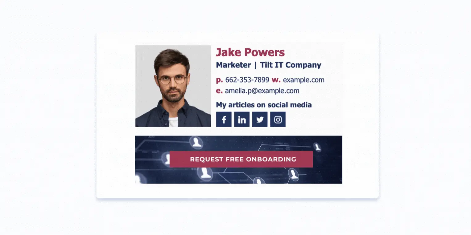
Turn marketing qualified leads to demos
Using an email signature that promotes free demos and consultations is a common practice for companies. Include a demo request link in the Sales department email signatures and see how it works. If you want to learn more about email signature marketing, see our detailed guide.
Promote webinars, conferences, or other events
Is your company going to introduce a product at a trade show soon? Or maybe you’re giving a speech at a conference? Make adjustments to your company email signatures to reflect that.
All your customer-facing teams also send tons of emails to customers. So why not share information that you’re participating in the industry-related event and would be happy to see them?
The email signature presented below has a promotional banner showcasing the fact that the company will be speaking at a conference.

Share reports, eBooks, and case studies
Keep your prospects informed and help them move to the next step of your sales cycle by incorporating case studies, reports, or eBooks into your email footer. It will be less promotional and pushy though quite effective.
This company prepared an industry research report and used a promotional banner to showcase it in their email signatures.

Increase video views
If you have a goal of reaching as many viewers as possible, try to distribute your video content on various relevant channels. Your email footer can be one of the best ways to let your potential customers see your video.
Check out how the influencer promotes her YouTube video in the example below.

Conclusion
Your email signature is a perfect addition to your marketing efforts. With a proper CTA, it lets you provoke recipients to take action: from visiting your blog to placing an order. Just think how many emails your entire team sends on a daily basis. All of them can be marketing opportunities.
Use this guide to make your next marketing campaign even more effective.

