Five Vital CTA Elements for Your Email to Kick off Your Campaign With a Bang
1. What is CTA in your email and why is it important for your campaign
2. When you should add a call to action to your email
3. Types of call to action in email marketing
4. CTA elements for your email. Best practices.
5. Purpose
6. Copy
7. Design
8. Placement
9. Testing
Useful tools:
1. Newoldstamp - Email signature marketing
2. Mailchimp - Email builder and sender
3. Reply.io - Personal email outreach, calls, and tasks
4. RocketLink - Your branded short linker
5. Canva - Online tool for making designs
What is CTA in your email and why is it important for your campaign
What are the most significant things you care about when you create an email marketing campaign? You certainly care about preparing the right content not to end up in the junk folder. And you do care if your email open rate is high and if your email template displays correctly. But what is even more important, is that your subscribers ultimately do what you were encouraging them to do in your message. How can you actually achieve this? Use CTAs in your emails. A call to action (CTA) is an engaging button or link that grabs a user’s attention and encourages him to take action. A successful CTA results in a conversion. Additionally, using an online signature creator for email ensures that your branding is consistent and professional, adding a polished look to each message.
When you should add a call to action to your email
Anytime you want a recipient to complete a task: download a file, follow you on Twitter or FaceBook, buy a product, fill out a form, or just click through to another page.
Even though using CTAs is an excellent opportunity to connect with customers, many businesses never add calls to action to their emails. Since you are reading this post, you don’t plan to be one of them, right? So let’s dive in and learn how to create a compelling call to action for your email marketing campaigns.
Types of call to action in email marketing
Depending on the type of actions you want the reader to take, the following types of CTA buttons can be distinguished:
-
CTAs that encourage to complete a purchase
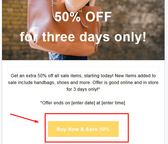
“Shop now. Get 25% off.”
“Get my spring wardrobe.”
“Get free shipping.”
-
CTAs for holidays
“Get my Thanksgiving coupon.”
“Yes! I want my birthday deal.”
-
CTAs for content
“Download My eBook.”
“Learn how to write cold emails that get answered.”
-
CTAs to collect feedback
“Take a survey. Make your voice heard.”
“Take a poll and get 10% off your next order.”
-
CTAs for social media
“Like us on Facebook.”
And many others.
CTA elements for your email. Best practices.
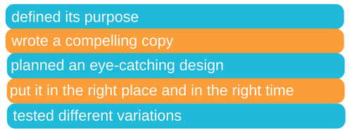
In order to create a powerful CTA for your email, make sure you a) defined its purpose b) wrote a compelling copy c) planned an eye-catching design d) put it in the right place and in the right time e) tested different variations. Now let’s take a closer look at each element.
Purpose
Before you start writing your call to action, you need to define its purpose. Think about the action you want recipients to take. Keep in mind that the action should be something they WANT to complete. Let’s imagine that you run an online store with clothing, and you want to email your audience with the purpose of increasing sales on a new spring collection. In this situation, most businesses would create an email with eye-catching images of the new collection and include a button that says: “Shop Now.” But does it actually work? How about something like "Get my new dress" or "Get my coupon"? We will be talking about using the “my,” “me,” and “I” pronouns later.
Copy
Be specific
Needless to say that a good call to action has to send a clear message. For instance, if you ask people to sign up, make your CTA button to explain to them what will happen when they click on it (e.g. "Sign up for regular email updates").
Give the benefit

If you want readers to click through, you must create a killer value proposition. Keep in mind that people prefer getting benefits rather than just following your instructions. That is why the CTA like "Get my free eBook" would work much better than the one that says "Download." Besides, the word “get” is one of the most effective to be used in CTAs.
Add a sense of urgency
Urgency is when a buyer feels like he needs to act quickly or right away not to miss an opportunity to get what you offer. You can create it in your call to action by adding the words like "now," "today," "ends," "expires."
Arouse Curiosity
Think about what else makes people click on a call to action. Perhaps it is a desire to find out more and know something? A well-crafted CTA tells your readers what they can get, but doesn’t give all the details. How does it work? For example, ask a question ("Looking for healthy food?") to which your audience may want to find the answer, and you will see better responses. Be sure, to be honest with your prospects and don't lie to them just to get many clicks.
Use verbs
When writing a copy for a CTA button, choose powerful, compelling verbs that attract recipients and drive engagement (e.g. “explore,” “join,” “save,” “build,” “grow,” “discover,” “learn,” “get,” and others.)
Make it personal. “Your” vs. “My.”
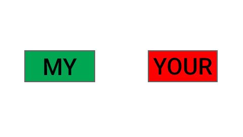
Did you know that pronouns affect click conversion rates? To make your call to action in email personal, be sure to use the right pronoun. But which one of the above-mentioned ones is more appropriate? Let's compare the following CTAs: “Start your free 15-day demo” and “Start my free 15-day demo.” According to tests, the “my” CTA resulted in 90 percent more clicks than the “your” page. Besides, psychologists say that pronouns "I," "me," and "my" make a person feel personally connected to a product he/she is going to buy.
Try negative approach
Occasionally, some marketers prefer using the negative technique in their email marketing campaigns. They just ask people not to click or not to read hoping that would make them act exactly the opposite way. However, keep in mind that most people feel more optimistic when they see words like “get,” “free,” and “yes.”
Design
Design plays a significant role in creating a powerful CTA. Follow these steps to achieve excellent results.
Use contrasting colors
Note that the color should pop. Choose eye-catching, contrasting colors that draw visitors’ attention. According to this test performed by HubSpot, red buttons performed better than the green ones. Why? Although, green connotes “Go,” and red says “Stop,” green was the dominant color on the page. Therefore, the green button did not catch the eye. The red, on the contrary, created more contrast.
Of course, you should not take the results of the test at face value and switch your green buttons to red immediately. We recommend you to test different colors before you come up with any decision.
Select proper size and think about mobile devices
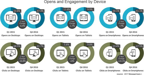
According to Email Monday, in the last three years, mobile email opens have grown by 180 percent. With that said, optimizing for mobile is the thing you should have done by now. In case you haven't, go ahead!
When it comes to consuming email messages on mobile devices, your call to action button must be touch-friendly. Remember how frustrating this may be when a button is too small for your thumb? Therefore, keep your calls to action big enough for recipients to tap them without any effort.
Add white space around CTA
Increasing the amount of white space around your CTA is another hack to draw readers' attention and make them click through. Surrounded by whitespace, the button will stand out more.
Mute other Buttons
If your call to action is not the only button on a page, mute the other buttons. Any secondary elements shouldn't distract the reader.
Placement
Along with a good copy and a great design, the CTA placement plays an important role too. The right CTA placement in email is a very disputable question among email marketing experts.
Some of them say your call to action should be “above the fold,” which means recipients should see it without scrolling down. Others assure that placing the call to action at the bottom of an email is more effective. In fact, it depends on the situation. If your message is simple, place your CTA on the top, but if it’s long and complex, the bottom will work better. CTAs on the top of a page will only convert those who already familiar with your product or service or, as we already mentioned if the offer is simple and concise. For those who don’t know much about you, the bottom placement looks more logical.
Duplicate your CTA in the body
In case of a long page, you don't want users to scroll back to find a specific CTA, so having duplicates in the body of your email would be quite helpful for users, especially if they are on a mobile device.
Testing
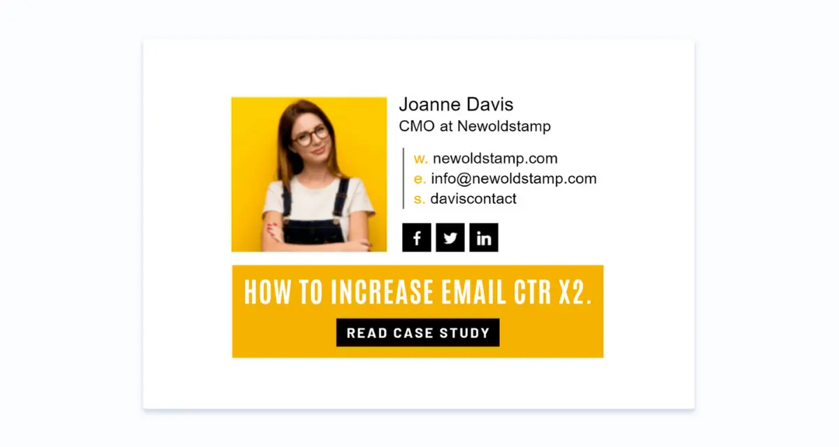
CTAs along with professional email signatures are quite powerful pieces of your email marketing campaign. In order to determine whether your email's call to action performs good or not, make sure you’re testing its content, design, and placement. Well, how do we do that? For instance, if you want to test a call to action text, you will need to create two or more different variations. One group of subscribers will get an email with "Create your free account" as the call to action text, and the other group will get an email that offers to “Create my free account.” Use the received data to make the best choice.
Click here to create email signatures with CTA banners right now
Conclusion
The success of your CTA depends on such factors like:
- correctly determined purpose;
- compelling and easy-to-understand copy that shows some benefits, creates a sense of urgency, and evokes curiosity;
- right colors, proper size, and smartphone-friendliness;
- placement dictated by the complexity of an offer;
- versatile testing.