How to Increase Demo Requests: the Most Efficient Tips
1. Optimize your website to get demo requests
2. Optimize your request a demo page
3. Optimize your request a demo form
4. Decrease your response time on demo request
5. Set up demo request email sequences and reminders
6. Turn support team into demo request generators
Have you ever felt like you can easily describe how awesome your product is if only you had an opportunity? Indeed, no landing pages or email newsletters are more descriptive than live human words. The only way you can use them is with a demo request - the thing we would like to help you make perfect to attract more leads.
via GIPHY
What Is a Demo Request
Sometimes your visitors find the service too complicated or just don’t want spending time examining the whole website. Requesting a product demonstration is the best option for them. It is the most direct way of promoting a product. Your representative speaks to a client via video chat or simply on the phone showing how your software works and answering questions if any emerge.
In the SaaS business, demos have an approximately 50% conversion rate. That is a comparatively big number, as half of those who book a demo end up buying the product. So ask yourself how to increase demo requests? The most efficient way to let people book a demo presentation is by showing the opportunity directly to them. There are some easy and simple tips you can use on your website to make sure your leads do schedule a demo. Let’s look through what we’re advising.
Optimize Your Website to Get Demo Requests
The first step is to add a demo request option to your website. Letting your visitors easily get help is often crucial. The bounce rate for your service in total can decrease a lot if you show how much you care about customers’ convenience.
Add request button to header and footer
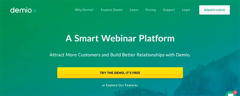
If someone needs a demo, you should make sure it is easily reachable. Truth be told, nobody will spend more than a minute looking for the ‘Request a demo’ button. If they need help, provide some right away.
source: contentsparks
Our best advice in this regard is having an aforementioned button both in the footer and the header of your webpage. As you never know where visitors will scroll first. Sometimes even seconds of wasted time can force people to make a decision to leave.
Set up push notifications on your chat
An even better way to help your visitors reach out for a live demo is by asking if they need some help with a live chat. You know, the one that emerges in the corner after a few seconds you spend on a website. It’s not a big deal if your visitor’s not interested in whatever it says. They can easily close it. But for those who need help, this chat is a lifeline.
source: neilpatel
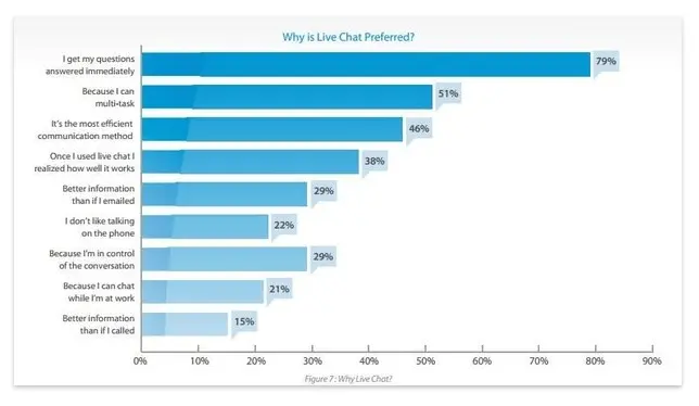
The reason for live chat being so good for marketing is that your visitors feel they can reach out for help anytime. There’s no need to send emails or call on the phone. 79% of website visitors use live chats to get their questions answered. Thus, adding the ability to request a demo through this chat is like asking people directly to book one.
Optimize Your Request a Demo Page
Now that you made sure people click the ‘Request a demo’ button, you have to perfect the next step, which is the demo page itself. The best demo request pages are as simple and straightforward as possible is essential. So, let’s go through everything.
What elements to add to your demo request landing page
First of all, let’s name the elements you need that assure a successful demo request.
-
Request a demo form
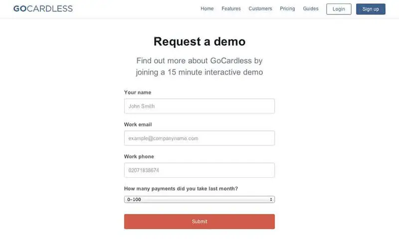
The form where people can type in all the information (that is needed to make a demo schedule) has to be simple and clear. Moreover, you should add it right to the landing page. There’s no need to have the form hidden behind more links. If a visitor clicks on the demo request, they want to get to the point ASAP.
Also, don’t add too many fields to your demo request form. Think about it. Even if you desperately needed a demo, would you want to fill in all your employees’ pets names?
source: gocardless
-
Make your headline clear
You should always stay creative but don’t overdo with a headline. The best request demo pages have simple and noticeable heading should. There should definitely be two words: ‘demo’ and ‘request.’ Everything else is up to you.
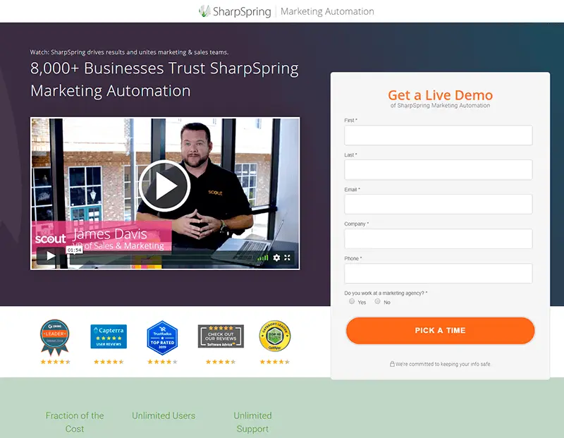
For example, here’s a demo page by SharpSpring. The headline is bright enough to distinguish it from the rest of the page, which is good.
source: sharpspring
Also, there is the word ‘demo’, so people can easily understand what the page is about. And the full name of the product below is beneficial for SEO. Another good thing about this page is a CTA button made in color with the headline.
-
Add straightforward Call-to-Action
The call-to-action (CTA) button you add to the demo request page is better to represent what will happen after a click clearly. As you have probably guessed, something like ‘Get a Demo’ is one of the best options. Also, something like ‘submit’ or ‘send’ is pretty much viable if the button goes after the demo request form.
-
Write a concise copy
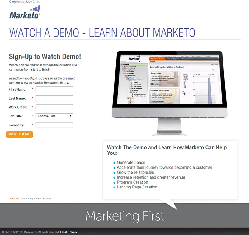
A demo request landing page is usually (and preferably) somewhat short. But it is a good idea to write some text on it. Firstly, it helps to optimize the page for search engines. Secondly, you can include some useful information that describes your product or the demo process after filling the form. For example:
- The purpose or main features of your service.
- What features will be covered in the demo.
- What people will learn exactly about the usage of your tool/service.
- How long will it take to conduct a demo.
- Users’ testimonials.
source: marketo
In addition, a few nice words make the page look more friendly and trustworthy.
-
Consider adding a short product demo video
Even if your visitor clicks on demo request, a short explanatory video or product demo presentation may be enough for them. So, do add it to a landing page. It will both help your customers and save the customer success team some time.
According to Crazyegg, adding a demo video can increase average session duration twice. Moreover, the time your visitors spend on a website in total is usually much more than the video duration. So, people actually spend their time looking through your features. In addition to all that, conversion rates increase by 10% with a video published on a demo request page.
-
Add Social proof
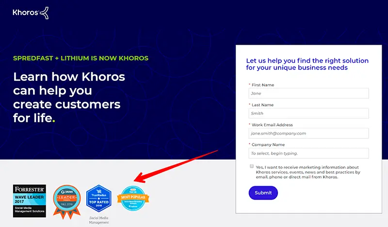
No words you say can better describe your benefits than social proof. The psychological effect it has often works really well. 70% of people usually tend to trust people they don’t even know if their names are listed on the website.
For example, you can add a block with famous brand logos that use your tool. Or insert a Capterra/G2Crowd link to your profile.
source: khoros
You can even write something like “1,000,000 satisfied clients use our tool.” Nobody will be able to tell if all these people are actually satisfied. But you can assume that it is true if they keep using your tool. Such big numbers that represent a positive outcome in your favor always work. So, it can make people desire to schedule a demo even more.
-
Add testimonials
And of course, real people like us (like your leads in this regard) are the most respected source of knowledge. Real testimonials that can be traced back to the people writing them are exceptionally good for your demo landing page. They can increase conversion rates by 34%.
Design tips for your demo request page
Now that you know what to add to your demo request page, make sure it is designed correctly. In fact, using some web design tricks can help people quickly catch up and not get lost on a page.
-
Make it clean and simple
While your home page can be full of beautifully designed elements, the demo page is all about being clean. You should make sure a visitor gets to booking a demo as quickly as possible. This way, it will be easier to read any essential text, and the CTA button will be distinguishable.
-
Use white space
White (or negative) space is simply empty spaces between the webpage content. It helps perceive everything better and concentrate visitor’s attention on the most important things.

source: apple
In this example, Apple uses white space to concentrate on how beautifully their product looks, and on a CTA button that leads to buying it.
If a person has come to a demo page, they already feel overwhelmed and might find something a bit complicated. Therefore, white space can make your visitors feel ‘free’ and ‘safe’. And you will subconsciously point them what they should do next (book a demo). Also, try adding more space between text lines to increase the readability.
-
Make your CTA stand out
Your CTA button should be bright and easy to spot. The whole process of filling in the form and scheduling a demo should be the simplest. A powerful call to action along with everything mentioned before makes it so. Apart from color, make a CTA font big enough.
Consider the example by Apple. The color of ‘Buy’ button is different from everything on the page. And the white space around makes it really stand out. So, you don’t actually need to reinvent the wheel. Just add some negative space.
-
Fit your page on one screen
A good demo request page easily fits on one average screen. People should see how many fields they have to fill, and the CTA button in the bottom should not dangle somewhere below the initial screen. On mobile, it is better to place the form on top of the page, as you won’t be able to fit everything anyway.
Best request a demo pages examples
source: hootsuite
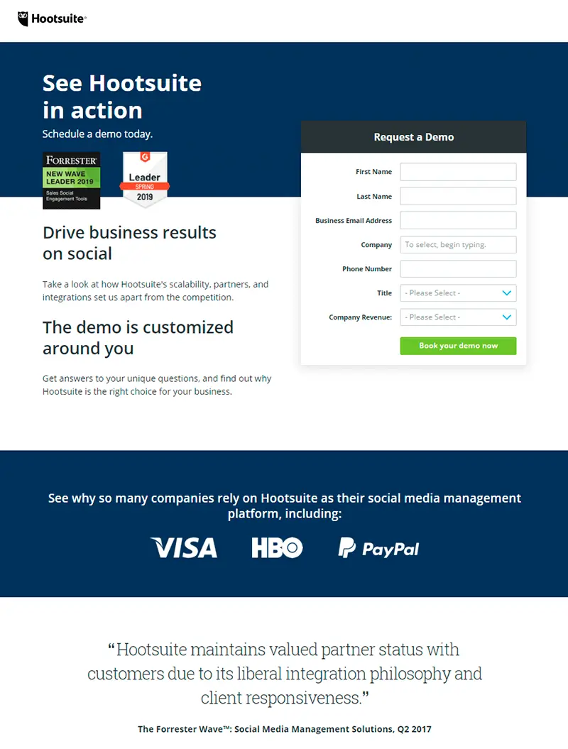
Hootsuite has made their demo request page simple but full of useful stuff. The headline is creative and aimed at promoting the Hootsuite name. Also, there’s a short sentence below with ‘schedule a demo’ keyword. The form is simple and short. Being placed on the right, it is complemented by some promotional text on the left. Also, there are review platforms bages, company clients logos and a testimonial. All these work awesomely good together to increase social trust.
source: sproutsocial
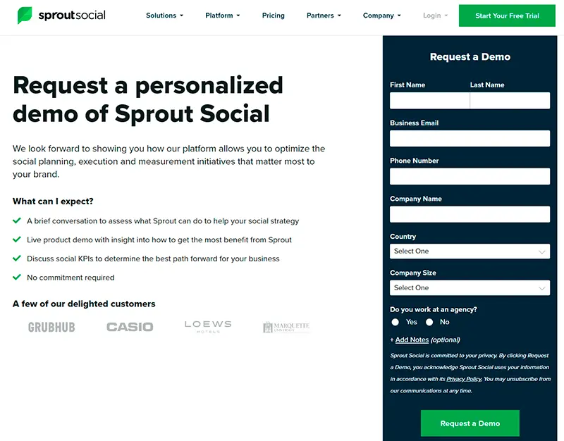
This SproutSocial’s demo request is even cleaner. Request a demo CTA button has a different color from everything else. Also, there’s a description of what to expect from a demo the visitor is about to book. And of course, some company logos are put below.
source: splash
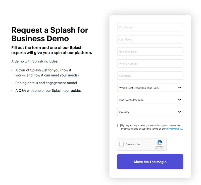
Splash used a lot of while space to make their demo request look neat. There’s no excessive information on the page, and everything but CTA button is in black and white. So, a visitor understands what’s going to happen next in the first glance.

source: hubspot
Hubspot has a long headline that contains both ‘get a free demo’ and ‘Hubspot’ keywords. So, it is easy to find from Google. Also, “Yes, I want a demo” is a nice way to persuade visitors they really need it. ‘Get your free demo’ call-to-action is the best in our opinion.
source: campaignmonitor
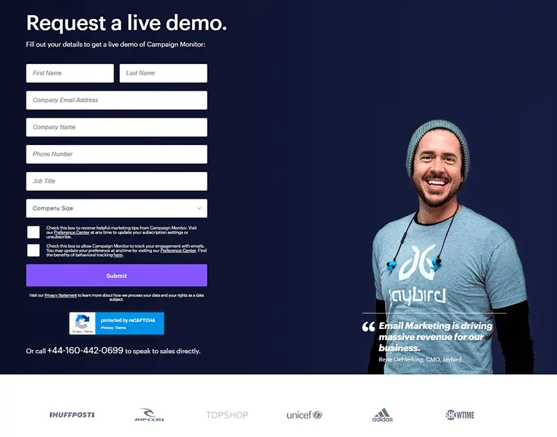
One of the best features of this demo request page by CampaignMonitor is that it has a Jaybird CMO’s photo on it. It adds to a more friendly look and works better than any social proof. Also, there’s nothing else but a fill-in form, which is also a viable option, as most visitors probably already know what CampaignMonitor is.
Optimize Your Request a Demo Form
After all, the whole request a demo page is about a form to fill. You should collect as much important information about your customers as possible. This will help you build a future demo according to the recipient’s needs.
Make it short but with all qualifying fields
As we have mentioned before, do not add a hundred and one forms. Figure out what information you really need to provide the best experience for your customers. Our list looks something like this:
- Customer’s full name
- Company name
- Company size
- Position
- Email address
- Phone number
- Country
Everything else might be useful but not at all essential. Also, it depends on your product. You might ask for the company's revenue numbers or add a field for comments. It’s OK to A/B test in this regard.
On the other hand, collecting some data can help you optimize the demo experience for a lead even before it begins. Just do not add too many fields. For instance, a question like “Have you ever used a similar tools?” can help you skip through a lot of initial stuff that your lead already knows. Instead, you will be able to focus on your exceptional features. That is, after all, the most important part.
Let your leads choose the booking time at once
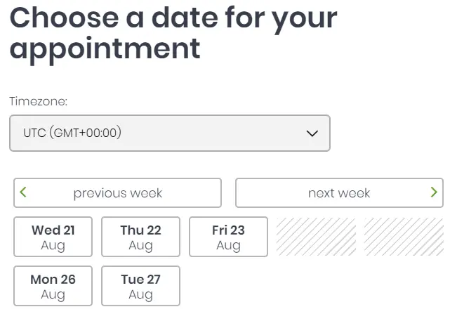
One of the most useful advice we can give is letting your recipients book the date and time for demo at once.
source: cogsworth
This way, people will be able to see when you are available and immediately check their own schedule. Also, nobody wants to spend a lot of time clicking through a long process of demo booking. Your visitors expect to be able to request a demo from a single web page.
Choose appropriate demo form template
Your demo request form template should be nicely implemented in the website layout. Think carefully about what your visitors will expect to see on a demo page. Make sure everything is in the right order.
For example, we would recommend putting a form to fill next to a calendar. Any additional text you need might go below. Alternatively, you can put a video demo on the left and a form on the right.
Another thing you should think of is whether you want everything on one page. As you can make the demo request process separated by ‘Next’ button. This option is useful if you have a lot of information to gather from customers and it won’t easily fit on one page.
Try to make everything simple and similar to your tool. Also, it’s always a good idea to A/B test if you have any ambiguities.
Tools for demo requests
There are some apps that can help you get the most out of your demo request with little time.
-
24 Sessions
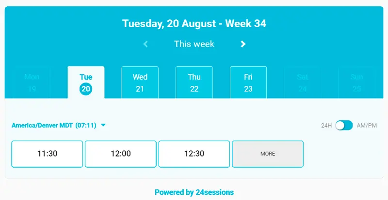
This web tool for making video calls is probably the best way to communicate with your leads. 24 Sessions allows creating a unique link for video call. Once your customer clicks it, they get to the chat without having to install any additional software. This works on mobile as well. So, you get an awesome tool to make crystal-clear calls or screen-share with any platform user.
In addition, you can implement 24 Sessions’ booking form to you website. It will save you a lot of time and resources you might have spent creating one yourself.
source: Newoldstamp
-
Lead Formly
Lead Formly is an online tool for creating and implementing high-quality forms on your website. It can help you build a demo request process easily and without coding. The design of these forms is really neat, though. You can also create a demo request email template with Lead Formly.
-
Sumo
Sumo is a great way to upgrade your website. You can add popups, share buttons, or smart bars that will collect visitors emails asking them to book a demo. It really helps make your website optimized for all users’ needs. However, there’s no booking calendar by Sumo.
-
Cogsworth
Cogsworth is a nice booking tool where you can create your own step-by-step appointment scheduling form. It has a convenient calendar feature, so you can use it with Sumo to enhance your user experience even more.
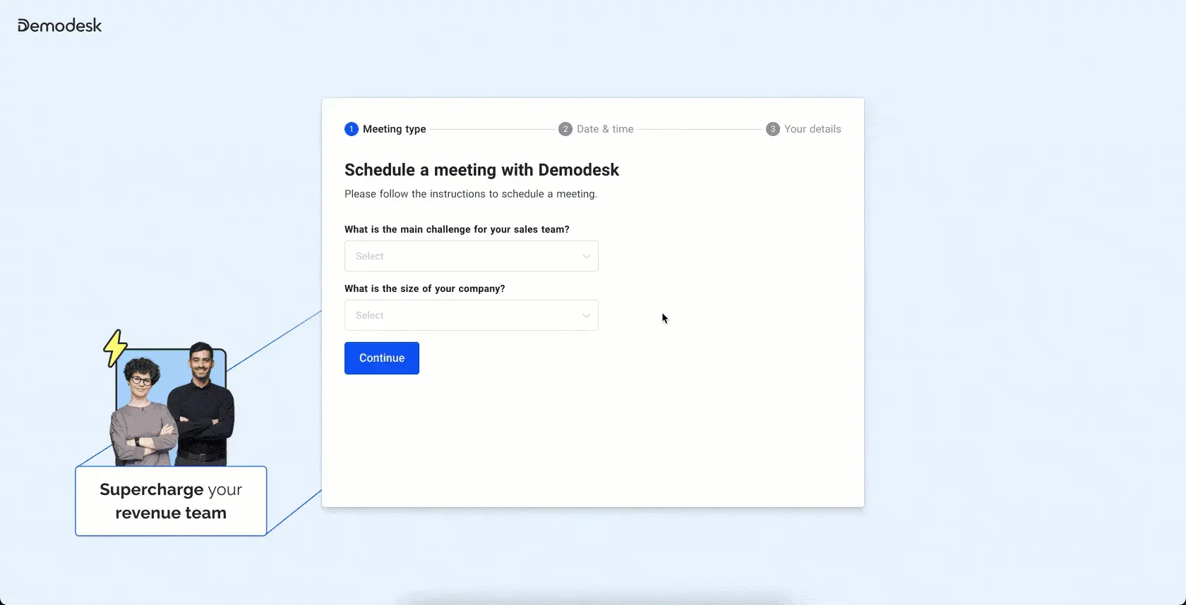
Demodesk’s scheduling & lead routing help you automate demo requests so that every prospect is routed to the right rep, based on their availability. Add your team’s scheduling links to email signatures, websites, or anywhere else so prospects can book demos quicker. You can even send automated invites & reminders to reduce your meeting no-show rates.
Since Demodesk is also a sales meeting platform, it helps reps convert more demos, accelerate their sales cycles, and close more deals by automating everything from the demo request to CRM data entry.
Decrease Your Response Time on Demo Request
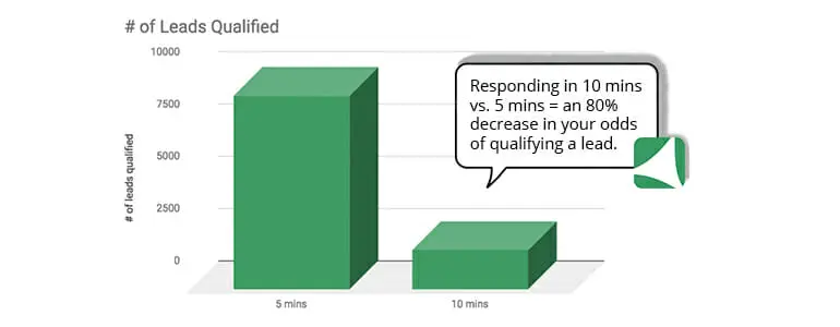
Once the lead has requested a demo, reach out as fast as possible. The whole idea of them being interested enough in your service to book a demo should be enough encouragement. People won’t wait for too long looking for a solution. And if they scheduled one demo, chances are your visitor is browsing through some other apps. The first to answer the demo request might be the winner. 78% of people buy from the company who reaches out to them first. And the conversion rate is almost 400% higher if you answer to a request in the first 60 seconds.
source: vendasta
Prioritizing demo requests might be a decision. Make sure the bookings are marked in your inbox so that your sales team can answer them. If somebody made a schedule, they would expect a confirmation. Thus, send a request for a demo email confirmation to your leads.
Set Up Demo Request Email Sequences and Reminders
Apart from demo schedule confirmation, use some reminders. Letting people know they have a demo in a week, a day, an hour is a good tone. Doing so will only increase the positive experience. Moreover, this way you save your sales team from wasting time on leads who simply forgot about a demo or decided not to show up.
Here’s how it looks:
- Your lead fills in the demo request form.
- Preferably, you can send a link to confirm their email.
- They receive request a demo email confirmation and details about a future call.
- If there are a few days, you can send some case studies or videos that explain your product.
- You follow up your lead the day before the demo to ask if they’re still interested.
- An hour before demo you send a follow-up one more time.
- After a demo, no matter how well it went, you send a thank-you email with sign-up CTA or pricing page link. Additionally, you can send a short description of what your demo was about. Although, it would take some time to write one, as you can’t automate that.
This list is very customizable. Whatever you decide to add or replace is up to you. Different industries or companies have a different perspective, so the demo should be addressed to those.
Turn Support Team Into Demo Request Generators
One more thing that can help you get a demo request. With all the emails sent by the support team regarding any issues visitors have, you can easily increase the number of demo request. Just add ‘Request a free demo’ call to action to every email sent by support department employees. This way, you will promote the demo and get a lot more requests.
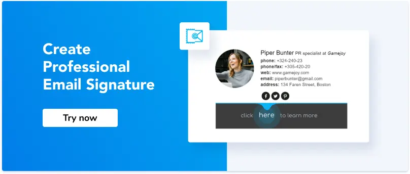
The best way to have such a CTA in your email without distracting recipients from the support ticket is an email signature. You can add a text, CTA button, or even promo banner with demo request page link. Use a professional email signature generator to do so.
Conclusion
Demos are one of the most powerful leads conversion channels. If conducted properly, a demo usually equals a satisfied new client. However, you should make sure the process of requesting a demo is simple.
- Add ‘Request a demo’ buttons to the header and footer of your website.
- Add ‘Request a demo’ buttons to email signatures of customer support and sales team.
- Optimize the design of the demo request page.
- Make the demo request form short and straightforward.
- Always send follow-ups to demo requests.
To sum up, give your leads the help they are looking for. Always remind them they can request a demo. Even more, encourage your visitors to do so. Because if they request product demo, you get the best opportunity to gain more clients.


