
23 Useful Tips with Examples: How to Make Your Email More Attractive and Efficient
Useful tools:
1. Newoldstamp - Email signature marketing
2. Mailchimp - Email builder and sender
3. Reply.io - Personal email outreach, calls, and tasks
4. RocketLink - Your branded short linker
5. Canva - Online tool for making designs
When it comes to effectiveness, email marketing is likely the top marketing channel for you and your business. What’s even better, it’s not as complicated as social media, SEO, or paid search. Also, it can be very cheap and time-efficient. With all the tools available, it becomes a no-brainer. Just invest some time into creating informative, transactional, and promotional content, deploy it to your mailing list, and harvest the results.
But it all is not as simple as it seems. Although everyone can market their brand via email, the question is how to make emails more attractive to existing and potential customers.
In this article, we’ll take a look at the most important elements and attributes of excellent email design and consider some best practices for creating appealing emails. Read along to see the 23 useful tips we’ve picked for you.
Tip 1. Check ready-to-use templates for email design inspiration
Let’s start with looking at the examples.
The top tip for creating a successful email marketing campaign is making it visual. If you are not a designer, it can be a little confusing. Fortunately, there are collections of ready email templates that you can look up and reuse for your brand’s purposes.
Certain services offer template galleries for email marketers to get some email design inspiration.
Freshmail, for example, offers a selection of visually stunning email templates for newsletters, transactional email, e-commerce, and more.
Campaign Monitor has a similar gallery. You can browse emails by marketing categories and see the most successful examples.
There is also Really Good Emails with its vast collection of email designs and templates. It is divided into categories and is regularly revised by the curators. The gallery offers examples of everything from welcome emails to newsletters and holiday-specific promos.
If you want to create your own beyond any doubt attractive email template, available platforms and tools allow you to do that. You can use their campaign constructor to build your layout using movable content blocks.
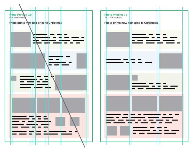
Tip 2. Make your copy easy to scan
Do you know that people don’t read the entire text, but rather scan the content following F-shaped patterns? We pay the most attention to what’s on the top and on the left, and our concentration decreases as we move to the bottom. So it’s better when the most critical pieces of content are at the top and/or left-aligned.
![]()
In any case, you should do the job of highlighting the most significant parts of your content for the recipient. Use images to communicate the message when possible, add captions, divide the text into sections and add headers. Use bold and bigger font size to make certain pieces stand out.
Tip 3. Keep it short and to the point
Don’t create an information overload by fitting as much content as you can into a single email. Normally, you should stick to one message per one email. In the case of newsletters, you can make them more informative. And still, make sure that your email doesn’t contain more than 9 pieces of information.
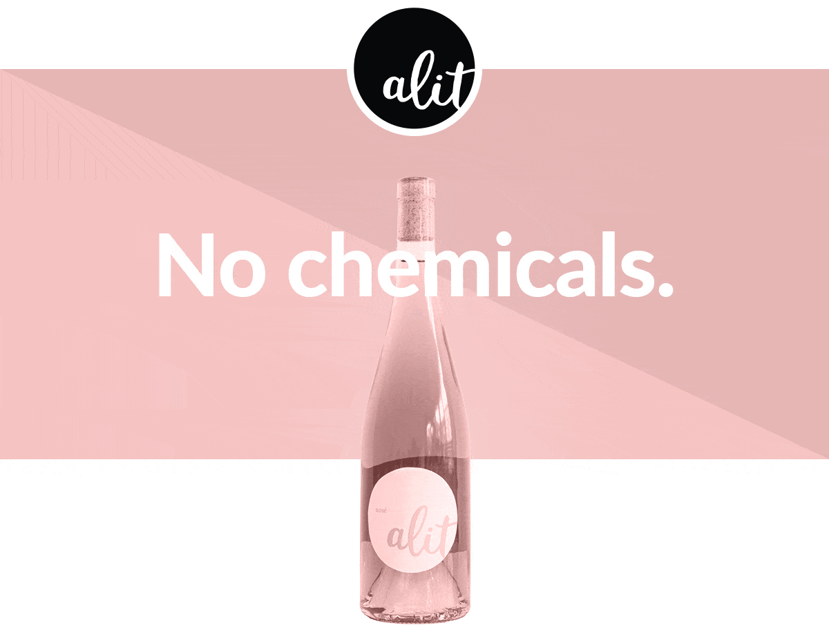
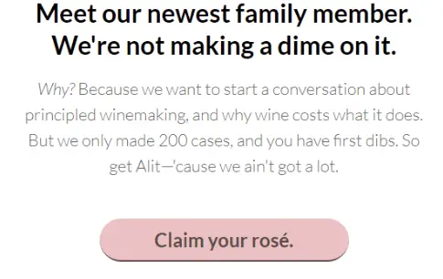
Image courtesy of Reallygoodemails
Tip 4. Create visual hierarchy
The visual arrangement of your content blocks should make sense for the recipient. If there are multiple elements in your email, arrange them logically. Make the most important chunks stand out through size, formatting, or color. But before that, place what matters the most at the top. All that post scriptum can rest at the end of an email.
Tip 5. Don't overuse vertical block divisions
It helps a lot when you use a grid to design your email. It has to be simple, with a few vertical divisions as possible (and not so many horizontal ones either). Align your elements according to the grid. This will ensure consistency and better readability.
Tip 6. Create an email header
The email header is the first thing your recipient will see when she opens the email, so your task is to associate it with your brand and make it memorable. Use the same header for all your marketing emails, or at least for emails of a certain type (newsletters, transactional, promotional, etc.).
A header should contain your company logo, the link to open this email in a browser, and some descriptional piece of text. It’s a nice touch to modify the header from season to season or play with it on various occasions — for example, by adding festive ornaments in your holiday newsletters and promos.
Tip 7. Design your footer
Footers are essential if you don’t want your email to end up in the Spam folder. A footer also contains important information about the company, provides an option for feedback, and tells the recipient what they can do in case they are no longer interested in your correspondence. An unsubscribe link is a vital part of your marketing emails. Neglecting it can result in fines for your business.
A footer is typically cut off from the rest of the email, but it still should be in line with the overall style.
Tip 8. Use brand identity and make it recognizable
Fonts, colors, a company logo, and the overall tone of voice constitute your brand identity. Your task is to make sure everything is consistent across all your channels, from the website to emails and social media. Always stick to your particular style when designing emails. Why? To make your brand recognizable, both contextually and visually, just like Apple does:
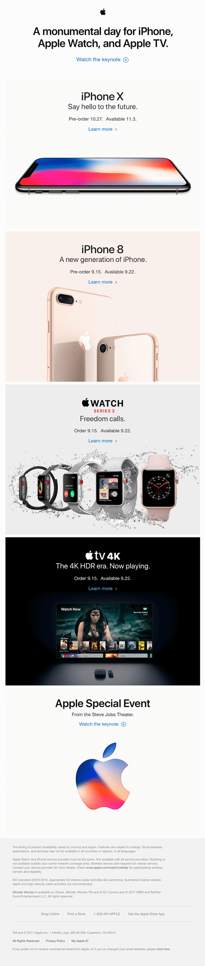
Image courtesy of Reallygoodemails
Play with color to create an attractive email template
Color is the number one secret ingredient of a majority of attractive emails. See for yourself:
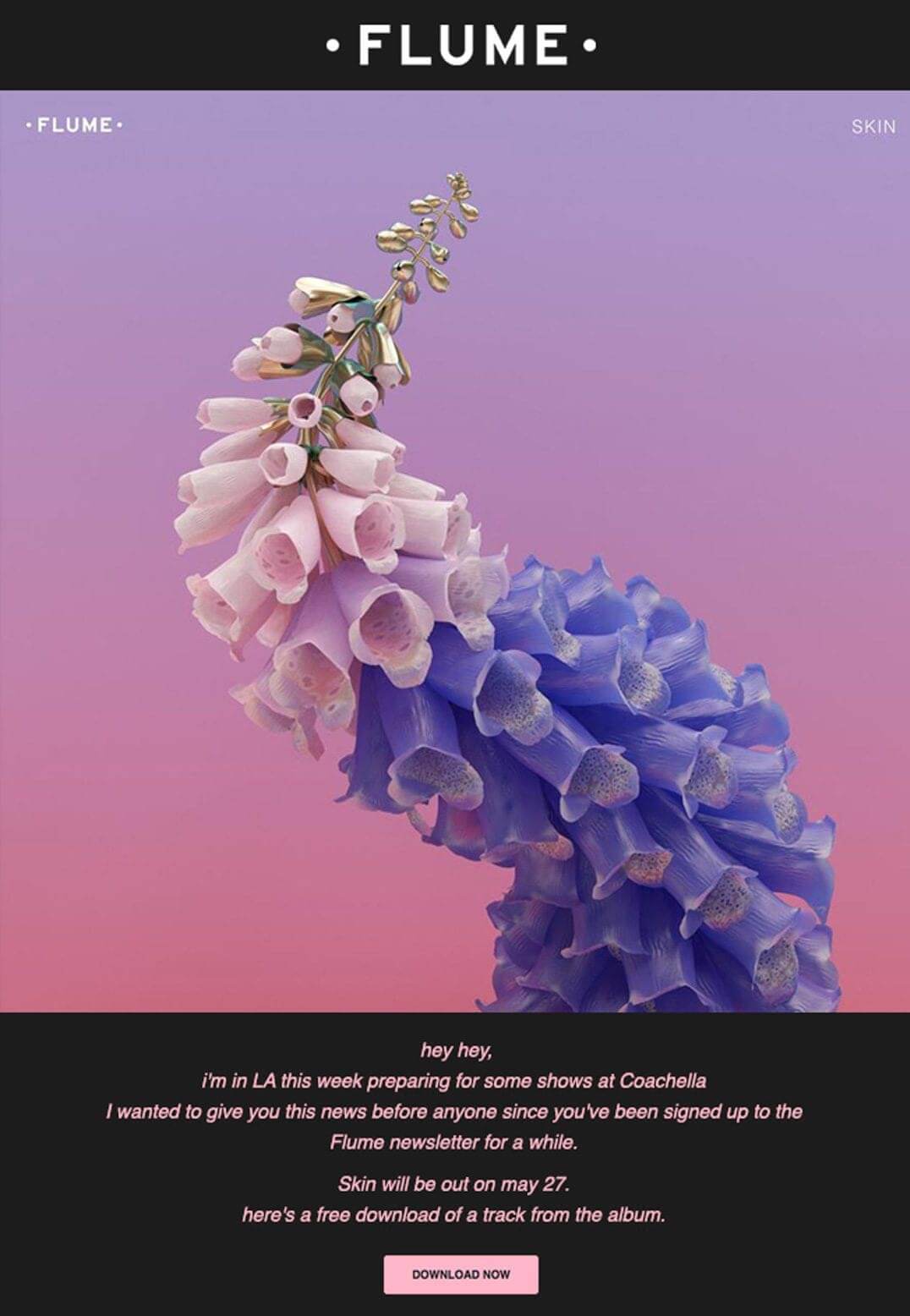
Image courtesy of Campaignmonitor
The main rule is not to overuse colors, but, at the same time, not to be afraid to play with them. A splash of one or two colors that stand out won’t hurt. Be bold when you want to drive attention to something, or when you are communicating a strong idea or an emotionally charged message (such as your summer sale).
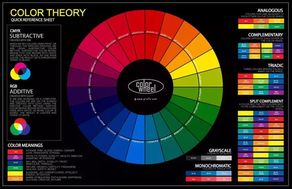
Tip 9. Use a strong color palette
When choosing colors for your email design, use a color wheel. Here, you usually have three options: neighboring colors for the monochrome design, contrasting colors for a bold one, and color triads for a vibrant solution. The image below will help you decide on choosing the best colors for your email:
Tip 10. Use white space
White space has nothing to do with the color white. It merely means empty, content-free space. It is a crucial element of any great design. White space increases the readability of your message by emphasizing the content pieces that matter the most. It ensures that your email feels clear and uncluttered.
Image courtesy of Reallygoodemails
Tip 11. Use color blocking
Using different colors for different content blocks might be an excellent solution for a vivid marketing email. It will help you separate different content sections. Use it in newsletters, digests, or all sorts of recaps. Be sure though that you stay true to the color palette of your choice.
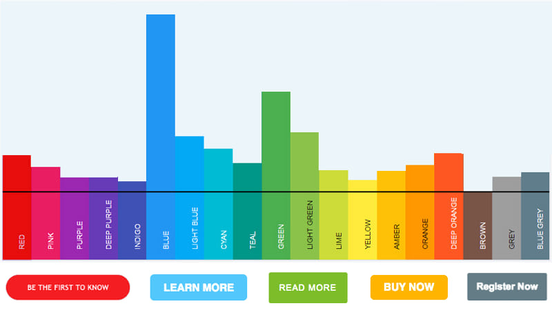
Tip 12. Use special color for CTA
Make your call to action stand out with the help of color. The choice of the latter depends on the purpose of your CTA, as well as on your palette choice. Might be that’s the perfect time to use contrasting colors.
Keep in mind that every color has its own meaning and is often associated with a different emotional state. Really Good Emails categorized CTA buttons according to colors and defined which color works best with different types of CTAs.
What to consider when using images
Visuals can make your emails not just more entertaining, but also more memorable. Moreover, an image can deliver your message better than words. Nevertheless, you need to consider several things when using images.
Tip 13. Keep retina and 4k screens in mind
Most present-day devices have high-definition screens, which makes using low-quality images a no-go. Even mobile phones with relatively small displays demand that you take this issue seriously. So remember: only high-resolution photos and pictures.
Tip 14. Add ALT tags to your pictures
Make sure your images have ALT tags. This helps recipients to figure out what your picture is about in case it is blocked by the email client or not downloaded correctly. Most email marketing platforms allow this option.
Here is how your ALT tags look with images blocked:
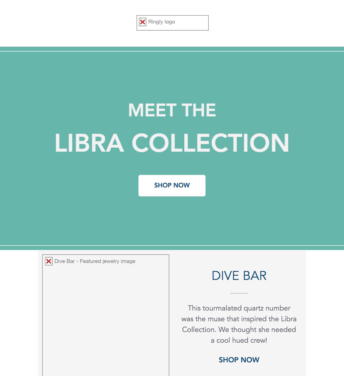
Image courtesy of Campaignmonitor
Tip 15. Background images
We advise you to use background color or texture instead of images. First of all, some email clients may not support background images. Secondly, background photos might not look the same on desktop and mobile. If your email generation tool supports background images, you can still try it. Again, test how your email looks on various devices and in multiple clients before sending it.

Image courtesy of Reallygoodemails
Keep image sizes in mind
There's one huge issue with using lots of images in emails. The size. Make sure each of your images is no more than 1 MB. Also, limit the number of images in the email. All this can save your messages from falling into Spam folders or displaying incorrectly. Just make sure every call-to-action is strengthened by an image.
The basic rules for CTAs
Effective CTAs help you reach your marketing goals. Therefore, they need to clearly communicate your recipients which action you want them to perform. After your subscribers read your email copy, they might ask a question “So now what?” Your CTA must answer this question.
Try the following tips to increase the chance that your recipients perform the desired action.
Tip 16. Repeat your CTA
You can include a CTA button once at the end of your email. That’s a good strategy, but only if your email is brief and easily fits into one screen (also on mobile). If it has multiple content blocks and sections, repeat it throughout the email several times, so that the user doesn’t forget about it.
By the way, you don’t have to use the same wording for all buttons. See what Shutterstock did here:
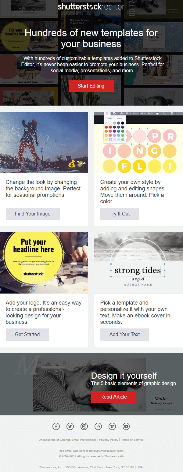
Image courtesy of Reallygoodemails
Tip 17. Do not dilute attention
Your CTA must tell your recipients to do precisely what you want them to do. Make it clear and actionable. Make it as concise as possible, not more than a few words long. If you have several goals in mind, decide on the principal CTA and make it stand out.
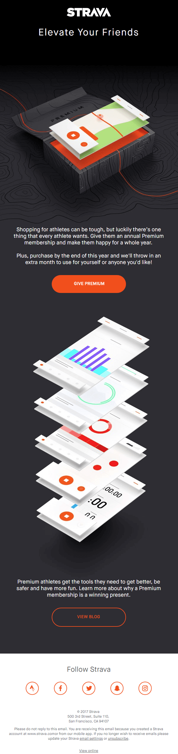
Image courtesy of Reallygoodemails
Tip 18. Limit the number of choices
A good practice is to have just one CTA message per email. More of them will only distract your subscribers by presenting them with too many choice options. Make it as easy as possible for recipients to act upon your cue.
A few more tips for creating appealing emails
There are more things to take care of when designing a captivating email. Although the list can be endless, we’ll name a few that we find paramount.
Tip 19. Add social links
Adding social buttons in the footer will let the subscribers connect with you socially right away. Use social media icons instead of links to minimize the space. Include more than one social profile — not everyone uses the same network.
It’s also a good practice to make emails shareable. This way, your brand can get better exposure and gain new potential customers.
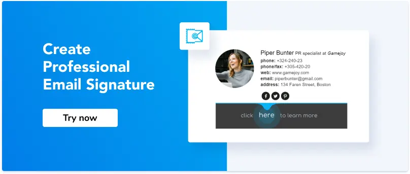
Tip 20. Add an email signature
If you are using email marketing for the promotion of your personal brand, you might consider replacing the email footer with a professional email signature. For example, you could include a link to your current promo offer in the signature rather than adding a new section to your newsletter. This way, you will maintain the integrity of your email while getting more clicks from those who are genuinely interested in the promotion.
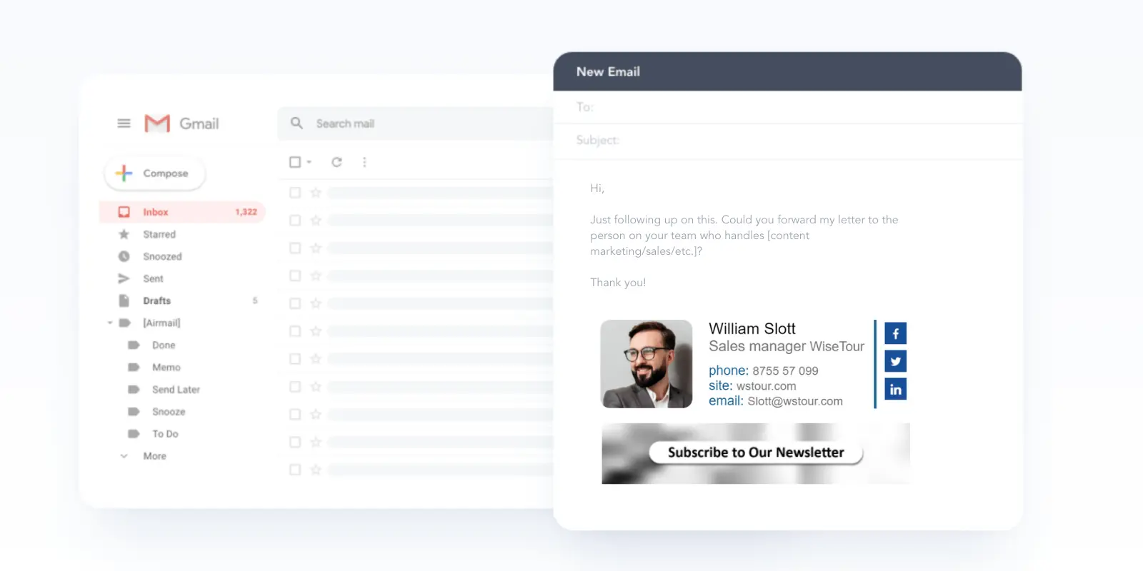
If you need more inspiration, see our gallery at NEWOLDSTAMP and pick an email signature template that would work for your brand.
Tip 21. Make it responsive and mobile-friendly
A significant part of your subscribers will open your email on their mobile devices. You should take care thereof by adopting responsive design. In other words, make sure that your email looks as stunning on mobile as it does on your laptop.
Imagine you have a beautiful multi-column template. Now picture how those columns would look on mobile? Fortunately, if you design emails responsively, multiple columns will transform into one when accessed from a smartphone. Just don’t forget to check if your email marketing software allows this feature.
Tip 22. Break the rules sometimes and go crazy
In design, following the rules is just as important as breaking them from time to time. Surprise your audience by providing them with something they didn’t expect. This is your chance to shine and to grab their attention.
Let’s see how to break the rules successfully using the example of an email from Adidas. The content structure and hierarchy is replaced with dynamic content. You cannot focus on one image long enough, as it switches to another one immediately.
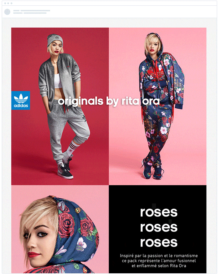
Image courtesy of Campaignmonitor
Tip 23. Use emails design tools
Still, concerned about how to make email more attractive when you lack designer skills? Just search for the ready templates and adjust them to your content, audience, and the needs of your business. Or use email campaign builders available within most email marketing platforms: MailChimp, Campaign Monitor, Mailjet, you name it.
Conclusion
You don’t need to be a designer to create beautiful emails and succeed in email marketing. There are enough tools that can help you with that. Get inspiration from your favorite templates and remember about clarity, consistency, and your brand identity. Use images, colors, and vivid CTAs. Arrange your content blocks in an order that makes the most sense. Make your copy scannable and your overall layout responsive.
In the end, when your email is ready, revise it and delete a thing or two. Don’t forget to send out a few tests. Once you and your colleagues like it hit the Send button and wait for the results to show in your dashboard.

