Email Signature Best Practices
1. Optimize your copy
2. Focus on design
3. Add a call to action
4. Include banners
5. Make your signature mobile friendly
It’s hard to think that an act as deceptively simple as signing your name can have such lofty implications. But it’s true—historically the signature has represented a binding contract. Monarchs have used it on royal decrees; revolutionaries have codified declarations of independence with it. And even in today’s digital age, people still take the time to sign off on an electronic correspondence with their name.
So what does your email signature say about your company and brand? Because this valediction represents so much more than the sum of its parts, you need to treat it with as much care as you would any other email marketing strategy. With that in mind, here are some email signature best practices for 2025.
Optimize your copy
This is a fancy way of saying you should ensure that you’re emphasizing the most important information. This can be done using an information hierarchy pyramid. In this pyramid, you compose your signature by presenting the most crucial information first and working your way down.
Oftentimes this follows a fairly straightforward formula: name > title > address > phone number > email > website > social media accounts. By presenting your contact info this way you ensure that your reader naturally processes the most important info first. An added tip is to turn your address info into a Google Maps link so readers don’t have to leave the email to find your office location.
Focus on design
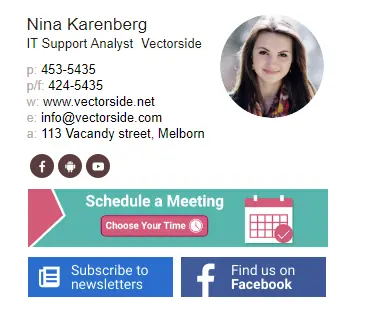
Just because you have limited space to work with doesn’t mean you shouldn’t take advantage of design opportunities. Adding an eye-catching logo or CTA (more on this below) in your information pyramid is highly recommended. Symmetry is also crucial, so make sure your text is aligned properly to the left of the screen. You can even utilize dividers and negative space (whitespace) to separate text, make it less crowded and more pleasing to the eye. Here are some examples of signatures that make good use of space and dividers.
Always remember, when it comes to design in an email signature: less is more. You don’t want your signature to be longer than seven lines, and you don’t want to clutter it with visual noise. That’s why one logo and one headshot is sufficient—adding a bunch of other graphics is just going to muddle the overall message.
Another tip includes limiting your text and images to two colors (more than that and you risk distracting the reader). Also, avoid using fancy fonts and go for something that is clean, elegant, and simple. When in doubt about which fonts to use, err on the side of caution and go with a Web Safe font. Mix and match them according to the style you feel is best.
Add a call to action
If you don’t have a logo to include, you should consider adding a CTA at the top of your signature. If you’re a tech company that is marketing a new CRM tool and you’re offering the first month free, then let your readers know with a nice clean button above your name. It saves them the time of having to manually leave the page and visit a site, and it gets the word out about your brand in the process.

But perhaps you’re currently engaged in marketing best practices like email segmentation and personalization. Maybe you’re worried that this is at odds with adding a CTA. The good news is that it’s not a one-size-fits-all proposition. You can customize CTAs according to your email personalization strategy the same as you customize your emails.
Include banners
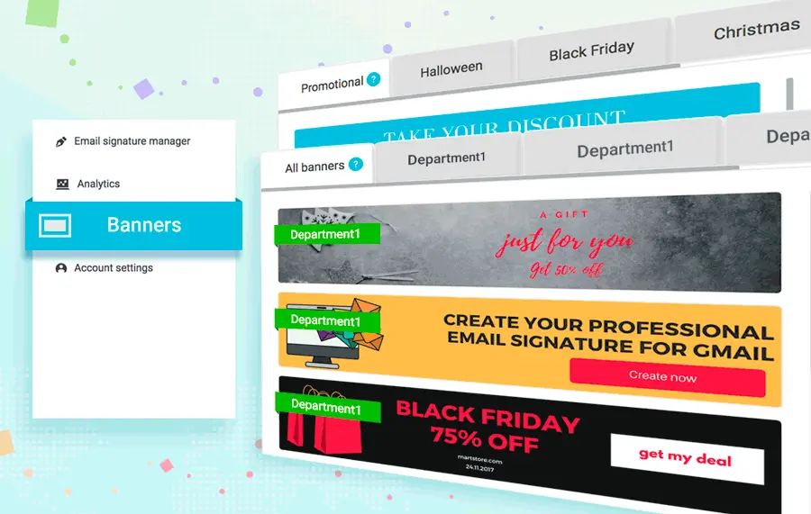
One surefire way to show off your industry expertise, increase conversions and enhance your promotion is to include banners. You can insert a number of things in a banner, such as a link to your company blog, an upcoming webinar, or other events. Banners increase brand awareness and allow you to reinforce your expertise by incorporating certificates of commendations your company has earned.

You can also raise awareness by adding banners that feature new product announcements and social-media feeds (a banner featuring your latest tweet is always great in an email signature). You can use them to promote any videos you have on YouTube, and you can even add a quick survey asking the reader if the email has been helpful. This can be valuable data for your customer service and sales departments.
The size of your banner depends on your audience. The industry standard for desktop computers is 600 pixels wide. However, You’ll likely want to opt for a 320px-size banner, as that is the standard for smartphone screens.
Make your signature mobile friendly

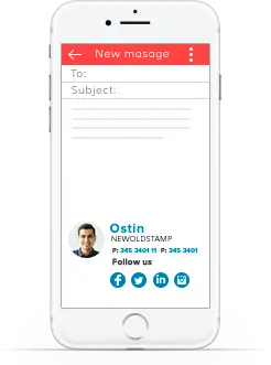
2016 was the first year that mobile internet searches surpassed desktop. Since then, the trend only continues to skew towards mobile internet usage. So not only should your email templates be mobile friendly, but your signatures should be too. Anything in your signature, including promotions and banners, need to be responsive as well.
As mentioned above, you need to take into consideration the width of the smartphone screen while also separating your text into multiple lines to ensure it fits on the page. Keep in mind, most email clients don’t offer truly responsive HTML signatures. That means your sig won’t be configured automatically to the screen size of the recipient in question. However, there are some signatures that are fully responsive, and you can find a list of them here.
Conclusion
These are some tactics to implement in 2025 to ensure your custom email signature is keeping up with the times. There are other, evergreen best practices too. For example, if you’re an independent contractor your signatures can be more casual in tone and style. If you’re designing a corporate email sig, you need to ensure that it maintains continuity and professionalism throughout every department. Establish standards and adhere to them no matter what email campaign you’re embarking on.


